The best Shopify checkout examples share four traits: express payment buttons at the top, few form fields, an order summary that shows the final total, and a look that matches the rest of the store. Five patterns cover most of what strong stores do. Express pay suits mobile-heavy stores. A trimmed one-page form suits every store. Branding suits design-led brands. Checkout extensions and Shopify Functions suit Shopify Plus merchants who want upsells and custom rules.
Checkout is where interested shoppers leave. Inspiration galleries show you a screenshot, but they rarely tell you which setting, app, or plan produced it. This article gives you five patterns. For each one you get what it looks like, how to build it, who it suits, and whether it needs Plus.
Nostra AI works with ecommerce storefronts on speed, bot traffic, and QA, and checkout is where a small bug costs the most. So you will also see how to test each change before shoppers find the problems for you.
Express payment buttons let a shopper pay in one or two taps, so this pattern gives you the biggest friction cut for the least work.
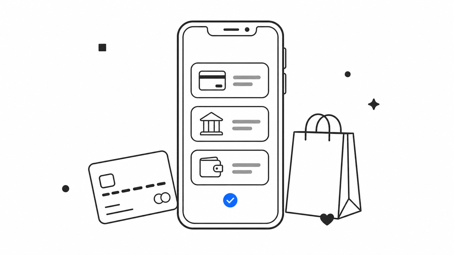
Shop Pay, Apple Pay, and Google Pay buttons sit at the top of checkout, above the contact fields, with a thin "or" divider before the regular form. Many stores repeat them on the cart and product pages. The shopper's saved address and card replace typing on a small screen.
Turn the wallets on in your payment settings. Which buttons appear depends on your payment setup and the shopper's device.
Stores with mostly mobile traffic and repeat buyers gain the most. It works on every Shopify plan, Plus included.
The fastest checkout is the one where a shopper never types an address.
A one-page checkout puts contact, delivery, and payment on a single page, and the gain comes from what you remove from it.
Shopify's checkout is a single page by default today. Contact details sit on top, then delivery, then payment, with the order summary beside the form on desktop and collapsed above it on mobile. Good versions feel short because optional fields are gone.
You mostly subtract. In your checkout settings, review each field and ask whether anyone on your team uses the data.
Every store. If your form still asks for more than a shopper needs to receive a package, start here before buying any app.
Every field you cut is one less reason to abandon the cart.
A branded checkout makes the last step feel like the same store, which reduces the "am I still on the right site?" doubt at the moment of payment.
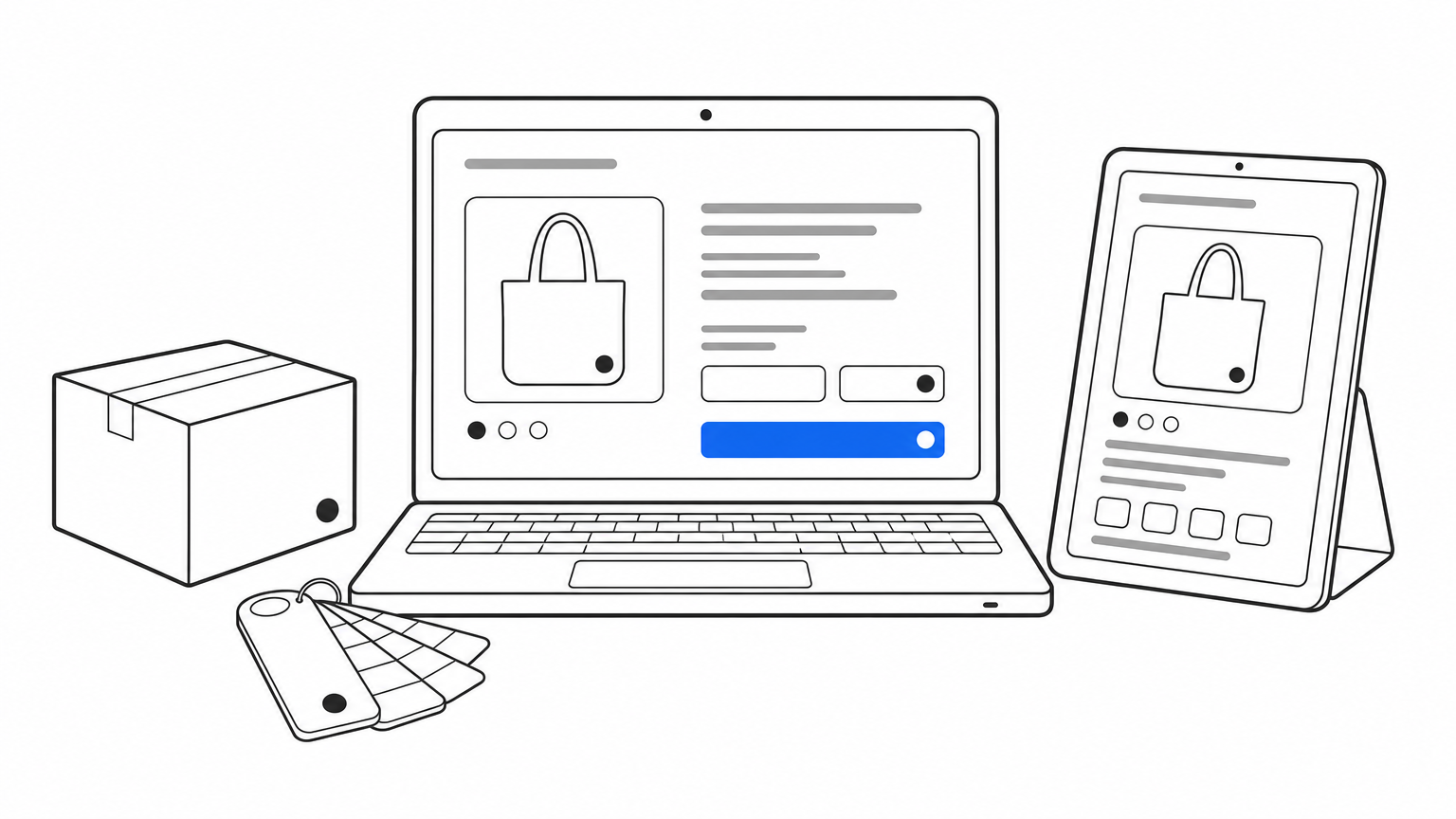
The logo, colors, fonts, and button shapes match the storefront. A banner or background image can carry the brand's tone. In many Shopify Plus checkout examples, this alone separates a polished checkout from a default one, even when the fields are identical.
Open the checkout editor in your theme settings.
Keep text contrast high. A pretty button that is hard to read costs more than it earns.
Luxury, beauty, and fashion brands, where the visual experience is part of the product. Basic branding is open to all plans, and Plus adds deeper control.
A checkout that looks like your store feels safer to pay on.
Checkout UI extensions add small blocks of content or functionality inside checkout, and they are the core of most Shopify Plus checkout examples.
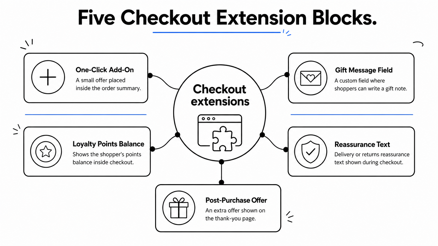
Typical blocks include a one-click add-on in the order summary, a gift message field, loyalty points balance, delivery or returns reassurance text, and a post-purchase offer on the thank-you page. Each is small and optional, so it never blocks payment.
Extensions come from apps in the Shopify App Store or from a custom app your developer builds. Customizing the main checkout steps requires Plus. Thank-you and order status page extensions are open to more plans.
Add one block at a time and measure average order value and conversion rate before adding the next. Every extension is another place for something to break, so test the full path on real devices. Patch, our QA agent, walks homepage to checkout on Chrome and Safari across desktop, iOS, and Android, and files bug reports with reproduction steps and video.
Plus brands with a clear average order value goal and a developer or agency to maintain the code.
Add one extension, measure it, and only then add the next.
Shopify Functions let you change how checkout behaves, not only how it looks, which makes this the most powerful and most technical pattern on the list.
The shopper sees a checkout that adapts. Payment methods can be hidden or reordered for certain carts. Delivery options can be renamed or sorted. Tiered discounts apply automatically. Validation rules can block an order that breaks a limit, such as a per-customer quantity cap on a limited drop.
Functions are small pieces of code that run on Shopify's backend and ship inside an app. Many public apps use them, and Plus merchants can build custom ones for payment, delivery, and validation logic.
Merchants with wholesale and retail customers on one store, limited releases, or complicated shipping. If your rules fit in a discount code, you do not need Functions.
Use Functions to remove manual order fixes, not to show off.
You do not need all five patterns. Start with express pay and a trimmed form, since both work on any plan. Add branding next. Move to extensions and Functions only when you have a specific order value or operations problem to solve, and you can measure the result.
Whatever you change, test checkout on real devices and watch your traffic. Fake sessions from bots distort conversion data and make a good change look like a bad one. If you want to keep bot traffic out of your checkout funnel, start with Edge Protect.


