The best Shopify checkout optimization work removes friction in a fixed order. Start with surprise costs and forced accounts, then trim forms and add payment methods, then fix speed, bugs, and recovery. If you run a small store, items 1 to 5 suit you best, because they are mostly settings changes you can make this week. If you run a larger brand with real traffic and paid media, items 6 to 10 matter most, since speed, QA, and clean data decide whether those gains hold.
Baymard Institute puts average cart abandonment at 70.22%, so roughly seven in ten loaded carts never become orders. Some of those shoppers were only browsing. A large share left because of friction you can remove, and the checkout is the last place you want to lose a buyer who already picked a product.
Shopify checkout page optimization has two jobs. You configure the checkout that Shopify hosts, and you control everything around it, such as your theme, page speed, and tracking. The 10 tactics below cover both. Each one explains why it matters, how to set it up in Shopify, and which mistakes to avoid. Nostra AI runs speed, QA, and bot protection agents on ecommerce storefronts, so items 7 to 10 draw on that work.
Make guest checkout the most obvious route, and let accounts form after payment. Forced account creation is one of the most reliable reasons a ready buyer leaves, and fixing it costs nothing.
Baymard's checkout research keeps listing forced account creation among the top abandonment reasons. A shopper holding a card does not want to invent a password for a store they may buy from once.
Accounts still help you, because they store order history and speed up repeat purchases. The trick is to create them after the sale, when the shopper has already paid and has a reason to save details.
A shopper who is ready to pay should never meet a password field first.
Shopify's new customer accounts are passwordless. Shoppers sign in with a one-time code sent to their email, and the account forms from that email after purchase, so saved details autofill on the next visit. Set it up like this:
The common failure is a theme or app that adds a login prompt before checkout, even though Shopify's own checkout does not need one. Open your cart in a private browser window and see what a new visitor sees.
Another is a tiny "continue as guest" link next to a big login button. If your flow shows both choices, make the guest button the larger one.
Show shipping, tax, and fees as early as the cart. Surprise costs at the last step push shoppers out, and hidden mandatory fees now draw legal attention too.
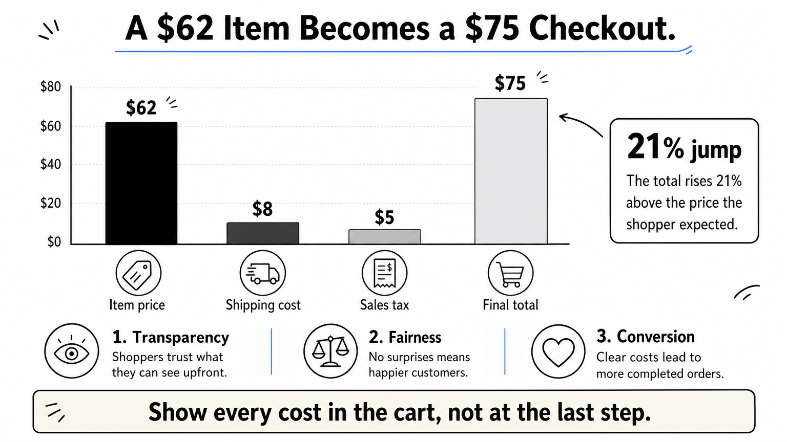
Baymard's research ranks unexpected extra costs among the top reasons for abandonment. Shoppers feel misled when the total jumps at the last step, and that feeling is harder to repair than a high price.
A quick example shows the effect. A shopper adds a $62 item, then sees $8 shipping and $5 tax at the final step. The total is $75, a 21% jump from the price they had in mind. States such as California now restrict mandatory fees that stay hidden until the end, so clear totals also lower your legal risk.
The total a shopper expects should match the total they pay.
Start with your shipping setup, because it causes the biggest surprise. Then work through these steps:
Pair this with a free shipping threshold just above your average order value. If your average order is $62 and free shipping starts at $75, shoppers need a $13 add-on, which is a small enough step that many will take it.
Do not add a handling fee that appears only at the last step. If you need to recover that cost, fold it into shipping rates or product prices.
Also avoid a free shipping threshold so far above your average order that it looks unreachable. Start modestly above it, then test a higher number once you see how shoppers respond.
Ask only for what you need to charge the card and ship the order. Baymard found the average US checkout shows 23.48 form elements by default, and most checkouts can drop 20% to 60% of them without losing anything they need.
Every field is a chance to stall, and typing on a phone makes each one costlier. Baymard's input research shows shoppers tense up once 10 to 15 fields pile onto one screen.
Fewer fields also mean fewer errors. A shopper who mistypes a ZIP code and gets a red warning is a shopper who may close the tab.
Every field you remove is one less reason to quit.
Shopify's checkout already uses address autocomplete, so a shopper types a few characters and picks a suggestion. Your job is to trim the fields around it in your checkout settings. These are sensible defaults for a consumer store:
| Field | Suggested setting | Reason |
|---|---|---|
| Full name | Require last name only | One less required entry |
| Company name | Don't include | Rarely needed for consumer orders |
| Address line 2 | Optional | Keeps apartment numbers possible |
| Shipping phone number | Optional or off | Require it only if a carrier needs it |
B2B stores will want to keep the company name. The point is to make each field earn its place.
The best checkout for most Shopify stores is Shopify's own, configured well, because wallets, Shop Pay, and checkout extensions plug into it. A third-party replacement can break those integrations and adds a script you must maintain.
Resist collecting marketing data at this stage too. Surveys and "how did you hear about us" questions can wait for the confirmation page, where they cannot cost you the order.
Put wallets above the card form, then add the local and installment methods your market expects. A shopper who cannot find a preferred method has a reason to leave on the last screen.
Stripe's testing of local payment methods found that showing relevant local options lifted conversion by 7.4%. Worldpay's Global Payments Report also puts digital wallets at the largest share of global ecommerce spending.
Shopify reports that Shop Pay can raise checkout conversion by up to 50% compared with guest checkout. Treat that as an upper bound from Shopify's own data, not a promise. The direction still holds: saved details beat typing, especially on phones.
Shoppers should pay the way they already pay everywhere else.
Start with wallets, because they remove the most typing. Then layer on the rest:
More is not always better. A long list clutters the page, and every method adds a flow you must test. Add the methods your country and device data support.
Check that express buttons appear where shoppers can see them. Some themes hide them inside cart drawers or push them below the fold on mobile. Place a test order with each wallet on a real phone after any theme change.
Make your policies visible, show payment marks shoppers recognize, and keep the checkout looking like your store. Baymard's testing finds shoppers judge a payment page by how safe it looks, not by the encryption underneath.
A first-time buyer enters card details on a page they have never used, run by a brand they barely know. A bordered, tinted, or familiar-looking form feels safer than a bare one, even when the encryption is identical.
Return policies matter just as much. Shoppers want to know who pays for return shipping and how long they have, and Baymard finds that many sites bury those answers.
Reassurance works best at the exact moment a shopper hesitates.
Trust work in Shopify is mostly policies and branding, and you can set both without code:
Skip generic "secure checkout" seals that shoppers do not recognize. Baymard notes that a badge helps only when shoppers know it, and an unfamiliar seal can raise questions instead of answering them.
A second mistake is a brand mismatch between store and checkout. If the checkout looks like a different company, apply your branding. Also rewrite policies that read like legal contracts, because shoppers who cannot parse a return policy assume the worst.
Test the full purchase on real phones, then fix tap targets, keyboards, and popups. Most ecommerce traffic now arrives on mobile, yet phones convert below desktop, so every bit of friction costs more there.
Baymard's mobile testing, which spans thousands of hours, keeps finding the same small-screen problems: typing a 16-digit card number, landing on the wrong keyboard, and mis-tapping a cramped field.
Shopify's checkout is responsive out of the box. The path to it is yours, though. Your theme, cart drawer, and popups decide whether a mobile shopper reaches checkout at all.
On a phone, a bad tap target costs you the sale.
Work through the mobile path on an actual iPhone and an actual Android phone, then apply these fixes:
These attributes bring up the correct keyboard and let the browser autofill:
<input type="email" name="email" autocomplete="email" inputmode="email">
<input type="tel" name="phone" autocomplete="tel" inputmode="tel">
<input type="text" name="zip" autocomplete="postal-code" inputmode="numeric">
Testing in a desktop browser's responsive mode is the usual shortcut, and it misses real keyboard behavior. Use real devices, and include Safari on iOS, where many shoppers buy.
Sticky elements deserve a check too. A sticky add-to-cart bar, a chat widget, and a cookie banner can stack up and cover the checkout button on a small screen.
Shopify hosts the checkout itself, so your speed work belongs on the pages before it: home, collection, product, and cart. Aim for Google's "good" Core Web Vitals thresholds and keep them there.
A Deloitte study for Google, covering more than 30 million mobile sessions, linked a 0.1-second improvement in load time to 8.4% more retail conversions and 9.2% higher average order value. Slow pages lose shoppers before they ever see a cart.
Speed also compounds across the funnel. A shopper who waits on the product page is less patient with the cart and checkout steps that follow.
Checkout conversion starts with how fast the page before it loads.
Use Google's Core Web Vitals as your targets, and read field data from real visitors, not just lab scores:
| Metric | Good threshold |
|---|---|
| Largest Contentful Paint (LCP) | 2.5 seconds or less |
| Interaction to Next Paint (INP) | 200 milliseconds or less |
| Cumulative Layout Shift (CLS) | 0.1 or less |
Compress and properly size images, audit your installed apps, and defer third-party scripts that are not needed on first load. If you lack engineering time, Nostra AI's Dash speed agent accelerates pages at the edge after a DNS-level change, with no code changes. Nostra AI reports up to 47% faster load times and roughly 3% expected revenue lift, with full acceleration in about two weeks.
Chasing a single Lighthouse score is the classic trap. Lab scores run on one simulated device, while your shoppers use many. Judge speed by field data.
Speed also regresses quietly. Every new app, tracking tag, and campaign banner adds weight, so a one-time audit goes stale within months. Monitor continuously, not once a year.
Run a full journey test, from homepage to payment, on real devices every week and after every theme or app change. A checkout bug costs you every shopper who hits it, and shoppers rarely report it.

Site errors and crashes are a documented abandonment reason, and they hide in narrow combinations: one browser, one variant, one discount code, one wallet. You will not find them by clicking through the store on your own laptop.
Changes cause most breakage. A theme publish or app update can break a flow that worked yesterday, and nobody on your team notices until revenue dips.
A bug you have not found is a discount you are giving every shopper who hits it.
Build a repeatable test path and run it on a schedule:
Nostra AI's Patch agent automates this. It walks the journey from homepage to checkout on real desktop and mobile devices, checks 100+ bug patterns, and files bug reports with reproduction steps and video.
Testing only on your own phone is the most common gap. Your device, browser, and logged-in state are not your customers' reality.
Do not treat support tickets as your bug detector. Most shoppers who hit a broken checkout simply leave, so silence is not proof that the flow works.
Turn on abandoned checkout emails and refine them over time. Many shoppers who leave have not decided against buying, and a timely reminder brings a share of them back at no ad cost.
A large share of abandoners are only browsing or not ready, according to Baymard's research. Those shoppers still showed intent, and they already gave you an email address.
Recovery also protects your paid media spend. Winning back one shopper who clicked an ad is cheaper than buying a new click.
The cheapest order you will win is the one a shopper already started.
Shopify's built-in abandoned checkout emails need little setup. Use this sequence:
For deeper segmentation, such as different messages by cart value, route the flow through Shopify Flow or an email platform like Klaviyo.
Putting a discount in the first email teaches shoppers to abandon on purpose and wait for the code. Save incentives for the second message.
Watch for overlap with completed orders, too. An email that nags someone who already bought, or points at a broken checkout link, does more harm than sending nothing. Test the full email flow end to end with your own address.
Track drop-off at each funnel stage and change one thing at a time. A single conversion rate tells you that you are losing sales, but not where.
Overall conversion hides the leak. Here is a worked example from a store with 10,000 sessions and an $80 average order:
| Stage | Shoppers | Step rate |
|---|---|---|
| Sessions | 10,000 | n/a |
| Added to cart | 1,000 | 10% |
| Reached checkout | 500 | 50% |
| Completed checkout | 250 | 50% |
That is a 2.5% conversion rate. Lifting checkout completion from 50% to 55% yields 275 orders, which is 25 more orders and $2,000 in revenue, with no extra traffic.
Bad traffic also distorts the picture. If 1,500 of those 10,000 sessions are bots, real sessions are 8,500, and true conversion is 2.94%, not 2.5%. Bots that pass for shoppers can send you chasing a problem that does not exist.
You cannot fix a checkout leak that your analytics hide.
Use Shopify Analytics to read the conversion funnel: sessions, added to cart, reached checkout, and completed checkout. Find the stage with the steepest fall and work there first. For theme changes on the path to checkout, a tool such as Shopify's Rollouts can split traffic between your current theme and a variant.
Keep the data clean as well. Nostra AI's Knox agent, which powers Edge Protect, blocks malicious bot traffic before it can distort analytics or waste ad spend, and Nostra AI reports more than 10 billion bots blocked annually across its brands.
Changing several things at once ruins the test, because you cannot tell which change moved the number. Ship one change per test, and write down what you expected.
Do not stop a test early because a result looks good. Let it run through at least one full week, avoid sale periods that skew behavior, and wait for enough orders to trust the difference.
Shopify checkout optimization pays off when you work in order. Remove the obvious blockers first: forced accounts, hidden costs, and long forms. Then add the payment methods shoppers expect, build trust, and fix mobile friction. Speed, QA, recovery emails, and funnel measurement keep those gains from eroding.
If you can only do three things this week, make guest checkout the default, show full costs in the cart, and trim your checkout fields. Then measure your funnel by stage so the next change targets the steepest drop.
The numbers you test against are only as good as your traffic. Bots inflate sessions and hide real conversion, so see how Edge Protect keeps bad bots out of your funnel before you read your next test result.


