Your ad spend gets someone to click, but that's only half the job. What happens in the next three seconds on the landing page decides whether they buy or bounce. Most teams obsess over headlines and hero images while ignoring the real drivers of landing page user experience: load time, layout clarity, and how fast a visitor can find what they came for. Fix the surface without fixing the mechanics underneath, and conversion rates stay flat no matter how good the copy reads.
Good user experience landing page design isn't guesswork. It follows proven landing page optimization tactics for enterprise ecommerce you can test and repeat: fast load speeds, clear visual hierarchy, mobile-first layouts, and friction-free paths to checkout. This article breaks down eight practices pulled from what actually moves conversion rate and revenue per visitor, not just what looks polished in a mockup.
We'll also flag common landing page user experience issues, like slow edge delivery and bot-inflated traffic data that skews your test results, that quietly sabotage even well-designed pages. At Nostra AI, we work with 300+ ecommerce brands where page speed and clean traffic data directly shape UX decisions, so these recommendations come from real storefront performance, not theory.
Visitors decide whether your page deserves their attention within seconds of landing on it. If your headline talks about features instead of outcomes, you lose them before they scroll. A clear value proposition answers one question immediately: what does this product do for me, right now, better than the alternative? That's the whole job of the top of the fold, and most brands waste it on clever wordplay instead of a direct benefit statement.
People skim before they read. Eye-tracking studies consistently show visitors scan a page in an F-shaped or Z-shaped pattern, hitting the headline, subheadline, and call-to-action button before anything else. If those three elements don't communicate a benefit, the visitor has no reason to keep scrolling. A vague or generic proposition doesn't just fail to convert, it actively confuses the user about what action to take next, which is the core of poor landing page user experience.
A landing page that makes visitors work to understand the offer has already lost them.
Start with the outcome your customer actually wants, not the mechanism behind it. "Ships in 24 hours" beats "proprietary logistics network." Structure your value proposition around a simple formula:
Test headlines against real customer language pulled from reviews, support tickets, or post-purchase surveys. Customers rarely describe your product the way your internal team does, and their phrasing usually converts better because it mirrors what they searched for.
The most frequent error is leading with company achievements ("award-winning," "industry-leading") instead of customer benefits. Nobody clicks an ad to read your press releases. Another common trap is burying the value proposition below a large hero image or autoplay video, forcing visitors to scroll before they understand the offer. Finally, watch for value propositions that try to say everything at once. A headline listing five benefits communicates none of them clearly. Pick the single strongest reason to buy and lead with that.
Speed is the silent killer of conversion rates, and the data on how load time shapes sales makes the tradeoff hard to ignore. Every extra second before your page becomes interactive gives a visitor another reason to hit back and try a competitor. Page speed isn't a technical nice-to-have anymore, it's a core part of landing page user experience that shows up directly in why shoppers bounce before they buy and in revenue per visitor.
Google's own research found that as load time goes from one second to three seconds, bounce probability increases by 32%, and it keeps climbing past that mark, according to Google's page speed research. Slow pages also throw off perceived credibility. Visitors associate lag with cheap infrastructure, even if your product is premium.
A slow landing page tells visitors your brand doesn't respect their time before they've read a single word.
Compress and lazy-load images, defer non-critical scripts, and serve assets from the edge rather than a single origin server, the same moves behind speeding up your Shopify store's loading speed. Nostra AI's Dash agent handles this automatically, monitoring performance and accelerating delivery with an Edge Delivery Engine™ without requiring a code change, which matters if your team doesn't have engineering bandwidth to spare. Brands running Dash have seen load times drop by up to 47%.
Teams often optimize desktop speed and ignore mobile, where most ecommerce traffic actually lands. Others treat speed as a one-time audit instead of ongoing monitoring, missing regressions introduced by new app installs or tracking pixels. Skipping real device testing is another gap, since simulated speed tests rarely match what an actual visitor experiences on a mid-range phone with average signal strength.
Eyes need a path. Without one, visitors land on a page and don't know whether to read, scroll, or click, so they often do none of the three. A strong visual hierarchy tells the eye where to go first, second, and third, guiding attention from the headline to the proof to the call-to-action button in that order. Get this wrong and even a fast, well-written page suffers from poor landing page user experience issues that show up as high bounce and low scroll depth.
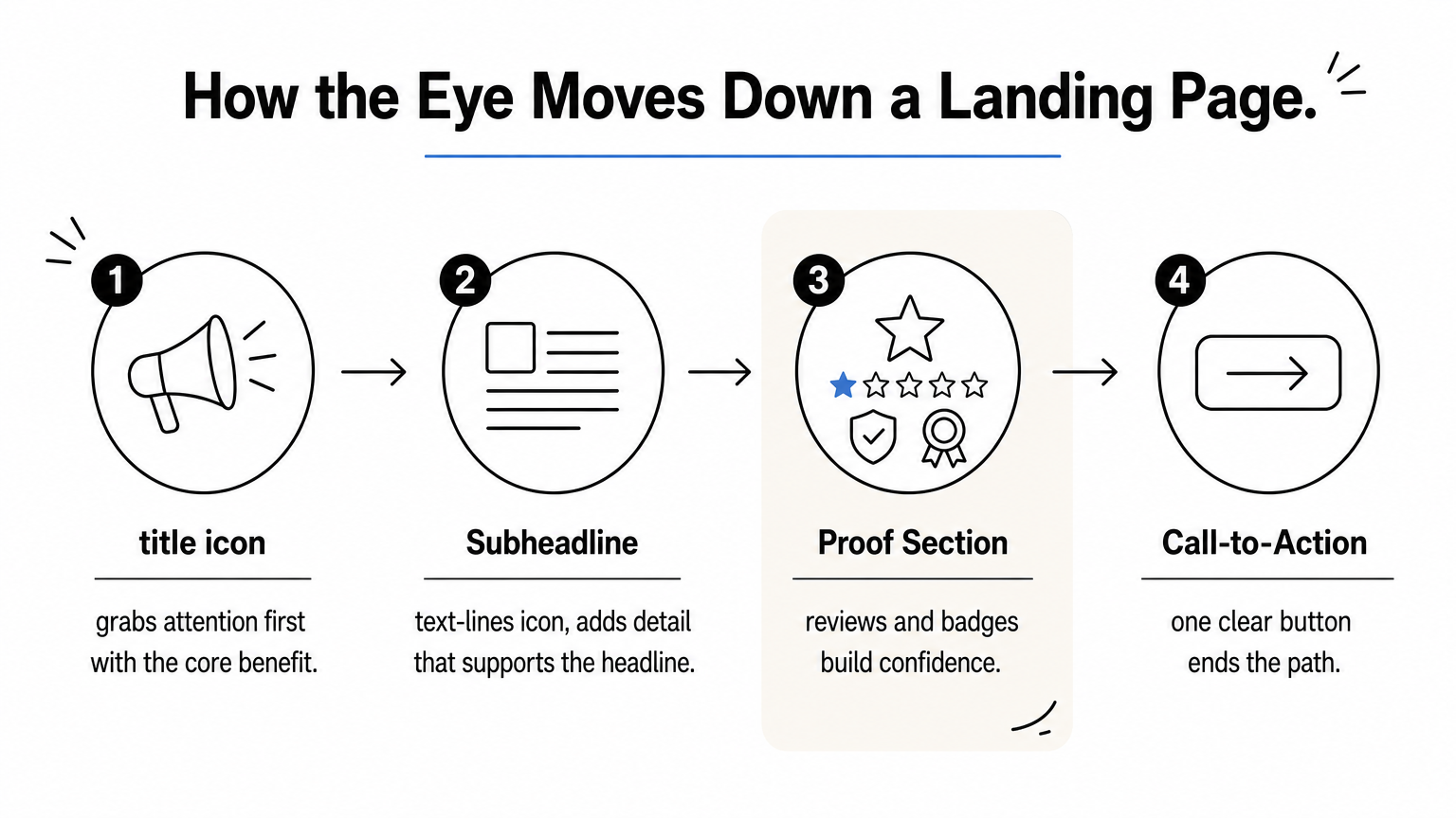
Visitors don't read landing pages top to bottom like an article. They scan for visual cues: size, contrast, whitespace, and color. If every element competes for attention at the same volume, nothing wins, and the visitor disengages.
When everything on the page shouts for attention, nothing gets heard.
Use size and weight to signal importance. Make headlines bigger and bolder than body copy, and give your call-to-action button a color that contrasts with the rest of the page rather than blending into your brand palette. Group related elements with whitespace so the page reads in clear sections instead of one dense block. Limit each screen to one primary action.
Overdesigned pages with five competing CTAs confuse more than they convert. Low-contrast text on busy backgrounds forces visitors to strain, and stock photography with no connection to the product wastes prime visual real estate that should reinforce the offer instead.
Most ecommerce traffic now arrives on a phone, yet plenty of landing pages still get designed on a wide desktop monitor and shrunk down as an afterthought. That order needs to flip. Mobile-first responsiveness means you design for the smallest screen first, then scale up, so the experience that matters most gets the most attention instead of the least.
Thumbs, not cursors, drive most of your traffic now, and that changes everything about spacing, tap targets, and scroll behavior. A layout that looks clean on a 27-inch monitor can turn into a cramped mess on a 6-inch screen, with buttons too small to tap accurately and text too tiny to read without pinching. This gap is one of the most overlooked landing page user experience issues because teams review their own work on desktop and never catch it, and it's a big reason phones convert lower than desktops.
If your landing page only works well on desktop, it's failing most of the people who see it.
Design your layout in a mobile viewport first, then expand for tablet and desktop, following these five steps to a better mobile store experience. Keep tap targets at least 44 pixels tall, stack content vertically instead of relying on side-by-side columns, and put your primary call-to-action within thumb reach near the bottom third of the screen. Test on real devices, not just a resized browser window, since actual rendering and load behavior differ.
Shrinking desktop layouts without rethinking hierarchy is the most common failure, leaving oversized hero images that push the offer below the fold on mobile. Fixed-width elements that force horizontal scrolling and forms with tiny input fields also drive abandonment before a visitor even reaches checkout.
Every extra field on a form is a reason for a visitor to quit. The gap between a landing page that converts and one that doesn't often comes down to how much effort you demand before someone gets value. Simplified forms and a single, obvious call-to-action remove the friction that kills momentum right when a visitor is ready to act.
Each additional form field increases abandonment, especially on mobile where typing is slower and more error-prone. Visitors arrive with intent, but that intent decays fast. Ask for an email and a name when you only need an email, and you've spent trust you can't easily get back.
Every field you don't need is a reason for someone to leave before they convert.
Audit every field on your form and cut anything you don't need to complete the immediate action. Use a single, high-contrast CTA per screen with action-specific text like "Get My Quote" instead of a generic "Submit." Autofill browser data where possible, and break long forms into steps with a visible progress indicator so the task feels smaller.
Multiple competing CTAs on one page split attention and reduce user experience landing page clarity. Asking for phone numbers or company details upfront, before establishing value, scares off visitors who aren't ready to commit that much information, which is one of the friction points that drive abandonment. Generic button copy like "Submit" or "Click Here" also underperforms compared to specific, benefit-driven action text.
Strangers don't hand over money without reassurance first, and a landing page full of bold claims with nothing to back them up asks for exactly that. Trust signals like reviews, ratings, security badges, and recognizable customer logos close the gap between what you say and what a visitor believes. Skip this step and even a fast, well-organized page runs into the same landing page user experience issues that cost you conversions: visitors who like the offer but aren't confident enough to buy it.
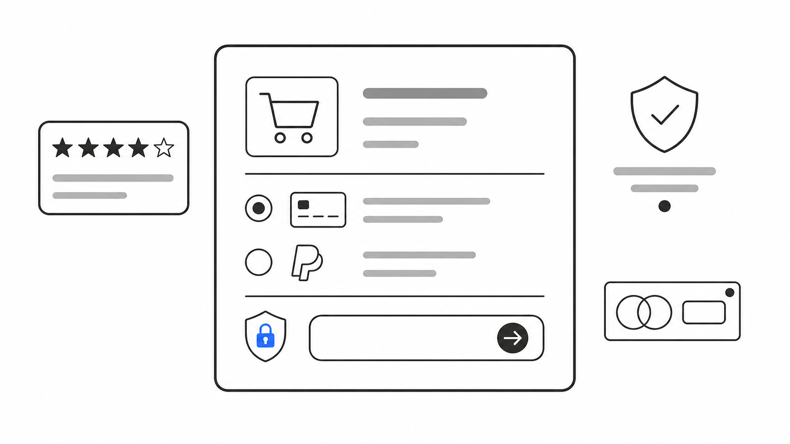
Social proof reduces perceived risk, which is the real barrier at the bottom of most funnels. Seeing real customer photos, verified review counts, or a recognizable press logo tells a visitor that other people already took the risk and it worked out.
People trust other customers more than they trust your marketing copy.
Place review snippets near your call-to-action, not buried in a separate tab. Show specific numbers ('12,847 five-star reviews') instead of vague claims, and include user-generated photos where possible. Security badges belong right next to payment fields, where hesitation peaks.
Generic five-star icons with no attached review count read as decoration, not proof. Bots inflating review counts or fake engagement metrics quietly erode the trust you're trying to build, which is one reason clean traffic data matters as much as the reviews themselves, so it's worth knowing the signs that your sessions aren't real customers. Nostra AI's Knox agent filters that bot traffic out before it distorts your numbers.
Every visitor carries a silent list of doubts: will this work for me, is it worth the price, what if I need to return it. A landing page that only pitches benefits without answering these questions leaves unresolved objections sitting between the visitor and the buy button. Handling them proactively, right where they surface, keeps momentum instead of forcing someone to search elsewhere for reassurance.
Hesitation compounds the longer a visitor scrolls without an answer. If a shipping question pops into their head near the product photos and nothing addresses it until the footer, they've already started drifting toward the back button. Poor landing page user experience often traces back to this exact gap between where doubt appears and where the answer lives.
Unanswered questions don't disappear, they just turn into abandoned carts.
Map the objections that show up most in support tickets and pre-sale chats: shipping cost, return policy, sizing, ingredient safety, compatibility. Place short answers near the section where each doubt naturally arises rather than clustering everything into one distant FAQ block. A one-line reassurance next to the price ('Free returns within 60 days') often does more work than a full paragraph buried elsewhere.
Dumping every objection into a giant FAQ accordion at the bottom forces visitors to hunt for answers they need earlier. Vague reassurances like 'satisfaction guaranteed' without specifics don't build real confidence, and ignoring objections tied to price or fit entirely leaves your strongest hesitations completely unaddressed.
No landing page is finished the day it launches. What converts today can flatten out in three months as traffic sources shift, competitors update their offers, or a browser update changes how your forms render. Continuous testing turns landing page user experience from a one-time project into an ongoing practice, which is the only way to keep pace with visitors whose expectations keep moving.
Assumptions about what visitors want are often wrong, even for teams who've run dozens of pages before. A headline that performed in one campaign can underperform in the next simply because the audience or season changed. Without structured testing, you're guessing, and guesses don't scale. Ongoing UX testing also catches quiet regressions, like a broken checkout step, before they cost you real revenue.
If you're not testing, you're guessing, and guesses don't scale.
Run A/B tests built for ecommerce brands on one variable at a time: headline, CTA copy, image, or form length. Watch scroll depth and click maps alongside conversion rate to understand why a version won, not just that it did. Automated QA matters here too. Nostra AI's Patch agent, the QA agent behind Edge Assurance, tests the full customer journey on real devices continuously, flagging broken flows with reproduction steps before they quietly tank a page's performance.
Testing too many variables at once makes results impossible to interpret. Stopping a test before reaching statistical significance leads teams to chase noise. And treating a single winning test as permanent, without rechecking months later, lets performance quietly decay unnoticed.
Good landing page user experience isn't one big redesign, it's eight small disciplines working together: a clear value proposition, fast load times, strong hierarchy, mobile-first layouts, simple forms, real trust signals, resolved objections, and constant testing. Skip any one of them and the others can't fully compensate. A gorgeous page still loses visitors if it loads slow or ships with skewed data from bot traffic that never should have counted in the first place.
Start with whichever practice is weakest on your current page, fix it, measure the impact, then move to the next. That's how the 300+ brands we work with actually improve conversion rate over time, not through a single overhaul but through steady, measurable fixes. Clean data makes every one of these decisions easier, since you can't optimize for real shoppers if bots are drowning them out in your analytics. If bad bot traffic is muddying your test results right now, see how Edge Protect keeps fake visits out of your funnel before they ever reach your site.


.svg)
