If you landed here from a Google Ads certification exam, the short answer is: relevant and original content, transparency and trustworthiness, and ease of navigation. But which attribute describes a good landing page experience matters just as much for your actual store as it does for passing a quiz, because how Google grades landing page experience feeds directly into your Quality Score, and a low score means you pay more per click for less traffic.
The attributes Google grades you on aren't abstract. They come down to how fast your page loads, how clearly it matches the ad that brought someone there, and whether visitors can actually complete a purchase without hitting friction. Page speed alone can tank an otherwise perfect landing page, and a confusing checkout flow undoes good copy just as fast.
In this article, we'll break down each attribute Google and Microsoft Ads actually measure, explain why they matter beyond certification exams, and show what a genuinely good landing page experience looks like for an ecommerce storefront, drawing on ecommerce landing page optimization practices that hold up at scale. We work with brands solving exactly this problem daily at the edge, so we'll point out where site speed and traffic quality quietly make or break the metrics you're being graded on.
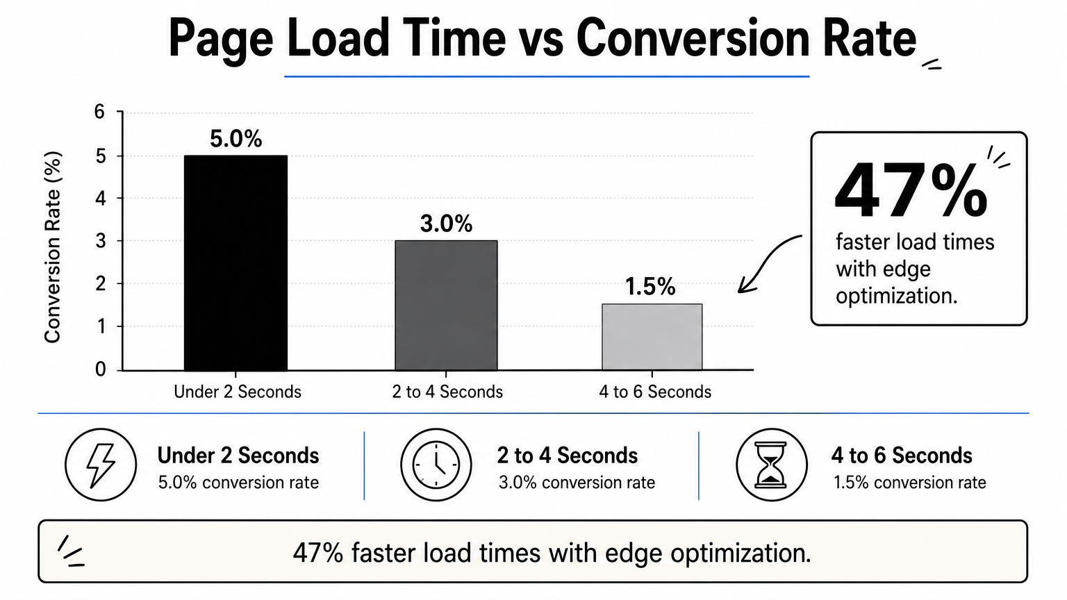
Speed is the first attribute Google's algorithm actually measures instead of inferring. Core Web Vitals are the three metrics Google uses to score real-world speed: Largest Contentful Paint (how fast the main content appears), Interaction to Next Paint (how quickly the page responds to a click or tap), and Cumulative Layout Shift (whether elements jump around while loading). Google publishes the thresholds directly in its Web Vitals documentation, and a landing page that misses those thresholds gets flagged as a poor experience regardless of how good the copy or offer is. This is one of the clearest attributes describe a good landing page experience questions has an objective, measurable answer to.
Because speed compounds every other metric on the page. A slow landing page inflates ecommerce bounce rate, which tells Google's Ads system that people aren't finding what the ad promised, which drags down Quality Score, which raises your cost per click. Amazon's own research found that every 100 milliseconds of added latency can cost measurable revenue at scale, and ecommerce conversion data consistently shows the same pattern: pages loading in under two seconds convert meaningfully better than pages taking four or five.
A landing page that loads slow fails the speed test before a visitor ever reads a word of your offer.
Here's what actually moves the needle on ecommerce Core Web Vitals:
Most ecommerce teams solve the easy 20% of this list, then get stuck because the remaining slowdowns come from app bloat and third-party scripts, tags, and widgets they don't control and can't easily remove. That's the exact gap Nostra AI's Dash agent is built to close: it's a site speed agent that accelerates every page at the edge, monitoring performance continuously without touching your codebase or requiring a re-platform. Brands running Dash have seen load times drop by up to 47%, which is the difference between a landing page that quietly bleeds Quality Score and one that actively earns it.
This attribute is exactly what it sounds like: the words and images on your landing page need to match what your ad promised. If someone clicks an ad for "30% off winter jackets," they should land on a page about winter jackets at 30% off, not your generic homepage. Message match is the technical term for this, and Google checks it algorithmically by comparing ad copy and keywords against your page content. Original content matters here too. A landing page that's just thin, duplicated, or copied boilerplate gives Google nothing to confirm relevance with, and it gives your visitor no reason to trust they've landed in the right place.
Relevance is one of the three components Google explicitly names when it grades landing page experience, alongside trust and navigation. A mismatch between ad and page confuses visitors, and confused visitors leave within seconds, which spikes your bounce rate and tanks the very Quality Score you're trying to protect. On the conversion side, mismatched pages waste the click you already paid for. Someone searching for a specific product who lands on an unrelated category page won't dig around to find what they wanted; they'll hit back and try a competitor instead.
If your ad promises a specific product and your landing page doesn't deliver it in the first screen, you've already lost the click you paid for.
Build dedicated landing pages per campaign instead of funneling every ad to your homepage. Match headlines, images, and offers word-for-word with the ad creative where possible. Keep the promised product, price, or promotion visible above the fold, and avoid stock content that could describe any brand's page. Original content, written specifically for that campaign, consistently outperforms recycled copy on both relevance signals and conversion rate.
Trust is the second attribute Google names outright when it explains landing page experience, and it comes down to whether visitors can verify who they're buying from and what they're agreeing to. That means a visible business name, working contact information, clear shipping and return policies, and pricing that doesn't hide fees until checkout. Transparent information also covers how upfront you are about data collection: if you're gathering emails or tracking behavior, say so, and link to a real privacy policy instead of a placeholder page. This is one of the attributes describe a good landing page experience answers that certification quizzes tend to gloss over, but Google's own algorithm checks for these signals directly.
Google penalizes pages that read as deceptive or that withhold information a reasonable shopper needs before buying, and that penalty shows up as a lower Quality Score across your entire account, not just one ad. On the conversion side, hidden shipping costs and vague return policies are among the top reasons shoppers abandon carts, according to research the Baymard Institute has published repeatedly on ecommerce checkout behavior.
A landing page that hides its policies until checkout loses the sale it already earned.
Put your return policy, shipping costs, and contact details somewhere a visitor can find in under five seconds. Use HTTPS everywhere, since Google flags non-secure pages as untrustworthy by default. Avoid fake urgency counters or inflated review counts; trustworthy information means every claim on the page has to hold up if a skeptical shopper checks it.
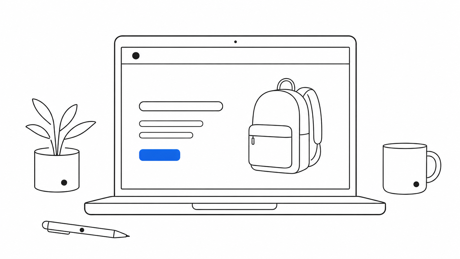
Navigation is the third attribute Google names directly when it defines landing page experience, and it's about whether a visitor can find what they need without hunting. Clear visual hierarchy means the headline, offer, and call to action are the first things a visitor sees, not buried under a cluttered menu or competing banners. Good navigation also means removing distractions that pull attention away from the conversion path, like a full site header with a dozen menu items when the visitor only needs one product page.
Google's algorithm looks at how easily a visitor can move from landing to action, and pages that bury the offer under clutter get flagged as a poor experience even when the content itself is relevant. Ease of navigation also drives conversion directly, and it's one of the simplest ecommerce CRO ideas to act on: every extra click or scroll a visitor has to make before finding the buy button is a chance for them to lose interest and leave.
A cluttered landing page asks visitors to work for the sale you should be making easy.
Strip landing pages down to what supports the conversion goal. That usually means:
Ecommerce brands that A/B test stripped-down landing pages against their standard site templates almost always see the simpler version convert better.
Most ecommerce traffic now arrives on a phone, so mobile-friendly design isn't a nice-to-have attribute, it's the default test Google runs first. A responsive landing page resizes text, images, and buttons to fit any screen without forcing visitors to pinch, zoom, or scroll sideways to read a price or tap a button. Google's own Search documentation confirms it evaluates the mobile version of a page for ranking and quality signals, since that's the version most shoppers actually see. If your page was designed on a desktop monitor and never tested on a 6-inch screen, you're likely failing this attribute without realizing it.
Quality Score calculations weight the mobile experience heavily because mobile clicks make up the majority of ad spend for most ecommerce accounts. A page that renders fine on desktop but breaks on mobile, think overlapping text, buttons too small to tap accurately, or a checkout form that requires horizontal scrolling, gets flagged as a poor landing page experience even if the desktop version is excellent. Conversion data backs this up directly, and it's why the mobile vs desktop conversion rate gap persists: shoppers abandon mobile pages that load slowly or render awkwardly far faster than they abandon desktop pages with the same issues, since the tolerance for friction on a phone is lower.
A landing page that only works on desktop is failing the majority of the traffic your ad actually generates.
Test every landing page on an actual phone before launch, not just a browser's device emulator. Use large, thumb-friendly tap targets for buttons and form fields. Keep forms short on mobile specifically, since typing on a small keyboard is its own source of drop-off. Compress images aggressively for mobile connections, and confirm your checkout flow works end to end on both iOS and Android before you spend a dollar sending traffic to it.
Every high-performing landing page asks visitors to do exactly one thing. A single call to action means one button, one goal, whether that's "Add to Cart," "Buy Now," or "Get 20% Off." Pages that offer three competing buttons, like newsletter signup, product purchase, and a blog link, split attention and dilute the action Google and your ad are actually optimizing for. This is one of the attributes describe a good landing page experience answers that's easy to state but surprisingly hard to enforce once marketing, design, and merchandising teams all want their own element on the page.
Google reads a cluttered call-to-action structure as a sign the page isn't built around a clear conversion goal, which weakens the relevance and navigation signals feeding your Quality Score. On the revenue side, a focused CTA removes the decision fatigue that kills conversions. Every additional choice you hand a visitor is a chance for them to hesitate, scroll away, or close the tab instead of buying.
A landing page with three calls to action is really a landing page with none.
Pick one conversion goal per campaign before you write a single line of copy. Then:
If you're running Nostra AI's Patch agent, the QA agent that walks your full customer journey on real devices, it'll flag pages where a broken or duplicated CTA button is quietly costing you conversions before a real shopper ever hits it.
Every field you add to a checkout or signup form is a small tax on the visitor's patience. Low-friction forms ask for only what's necessary to complete the purchase or capture the lead, skipping extra fields like a phone number or company name unless they're actually required downstream. This attribute also covers guest checkout, autofill support, and payment options like Apple Pay or Shop Pay that let a shopper skip typing their card details entirely. A landing page can nail speed, message match, and trust signals and still lose the sale at the last step if the form itself is the obstacle.
Google's landing page grading looks at whether visitors can complete the intended action easily, and a bloated form works against every other signal you've built up. On the revenue side, the checkout flow is where friction costs the most money, since you've already paid for the click and earned the interest by this point. Baymard Institute's checkout research consistently finds that unnecessary form fields and forced account creation are among the top reasons carts get abandoned right before payment, which is where most of the work of fixing checkout friction actually happens.
The form standing between a visitor and checkout is the last chance friction gets to cost you a sale.
Audit your current form field by field and cut anything you don't strictly need:
Running Nostra AI's Patch agent across the full customer journey catches broken form fields and checkout errors on real devices before they quietly drain conversions.
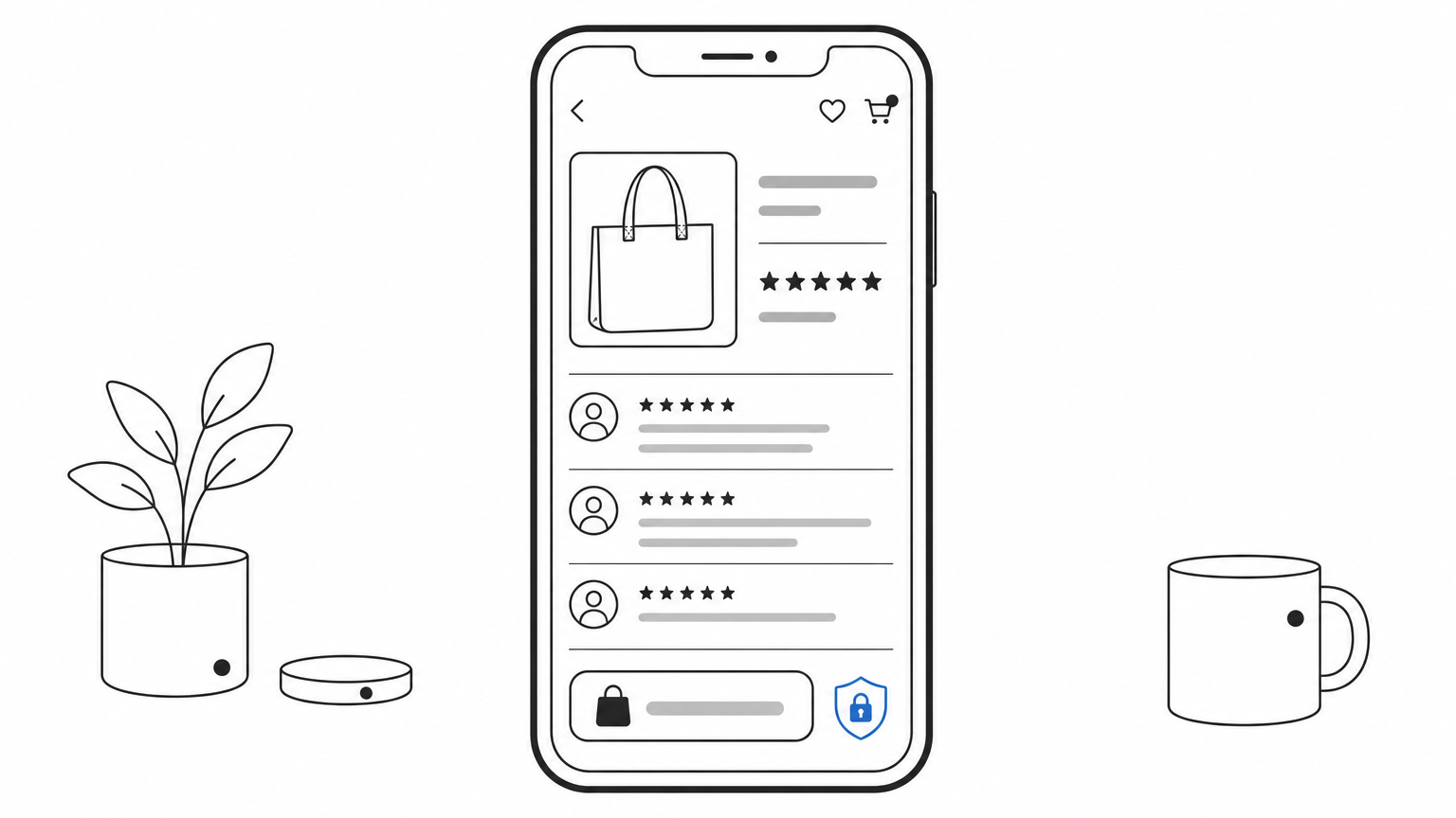
Shoppers rarely buy from a brand they've never heard of without some evidence that other people bought and were happy. Social proof covers customer reviews, star ratings, user photos, press mentions, and trust badges from payment processors or security providers. It's different from the transparency attribute covered earlier: transparency is about honesty in your own claims, while social proof is about third parties backing those claims up. A landing page with a strong offer but zero reviews or testimonials asks visitors to take a leap of faith that most won't make.
Google doesn't grade review counts directly, but pages with visible trust signals tend to score better on the broader trustworthiness attribute, since they give visitors independent reasons to believe the page. On the conversion side, the effect is bigger and better documented. Displaying star ratings and review counts near the product or CTA consistently lifts add-to-cart rates, because shoppers use other buyers' experiences as a shortcut for risk they'd otherwise have to research themselves.
A landing page asking someone to trust a stranger's word converts worse than one showing a thousand strangers already did.
Place star ratings directly under the product headline, not buried in a tab further down the page. Show a handful of specific, detailed reviews instead of a generic average score alone. Include recognizable trust badges, like secure checkout icons or as-seen-in press logos, near the payment step where hesitation peaks. If you're short on reviews for a new product, borrow proof from your broader catalog or brand reputation rather than leaving the section empty.
A good landing page is never actually finished. Ongoing testing means running structured A/B tests for ecommerce or multivariate tests on headlines, images, CTA copy, and page layout instead of publishing once and walking away. Measurement means tracking the metrics that actually matter, conversion rate, bounce rate, and revenue per visitor, not just clicks and impressions. Google doesn't grade you on whether you test, but the pages that consistently score well on every other attribute got there through iteration, not a single lucky draft.
Google's algorithm recalculates your landing page experience score continuously as visitor behavior changes, so a page that scored well six months ago can quietly slip if you never revisit it. Continuous optimization is how top-performing accounts stay ahead of that drift. On the revenue side, testing compounds. A 5% lift on headline copy plus a 5% lift on CTA placement plus a 5% lift on form length adds up to a meaningfully different conversion rate over a quarter, even though no single change looked dramatic on its own.
A landing page you stop testing is a landing page that's already starting to underperform.
Build a simple testing cadence instead of one-off experiments:
That last point trips up more teams than it should. Nostra AI's Knox agent blocks bot traffic before it hits your analytics, so the data you're testing against actually reflects real shoppers.
Every attribute in this list points back to the same idea: remove friction between the click and the sale. Speed, relevance, trust, easy navigation, mobile design, a single CTA, low-friction checkout, social proof, and ongoing testing aren't nine separate projects, they're one connected system, and a weak link in any of them drags down your Quality Score along with your revenue. Google grades these attributes because they map to what actually frustrates shoppers, not because they're arbitrary checkboxes on a certification exam.
Getting all nine right by hand, across every campaign and every device, isn't realistic for most ecommerce teams already stretched thin. That's the gap Nostra AI's edge agents were built to close, handling speed, bot traffic, identity, and QA automatically so your team can focus on the offer instead of the plumbing. See how Nostra's AI agents run your store and get a landing page experience that earns its Quality Score instead of fighting for it.


.svg)
