.svg)

.svg)
.svg)
.svg)
Everything You Need to Know About Google's Mobile-First Indexing Update
First announced in 2016, Google's mobile-first indexing update has been underway since 2018 — the beginning of the end for desktop's prominence in the search engine landscape.
According to John Mueller from Google, “The small set of sites we’ve still been crawling with desktop Googlebot will be crawled with mobile Googlebot after July 5, 2024...”
Fast forward to 2025, mobile-first Indexing is now standard practice for websites across industries.
It doesn't matter how polished and high-performing your desktop website is. If you haven't made the necessary adjustments yet, you're in for a tough time trying to boost or maintain your search engine rankings.
That's why, in this post, we'll dive into everything there is to know about mobile-first indexing, why it matters, and how to
What is Mobile-First Indexing?
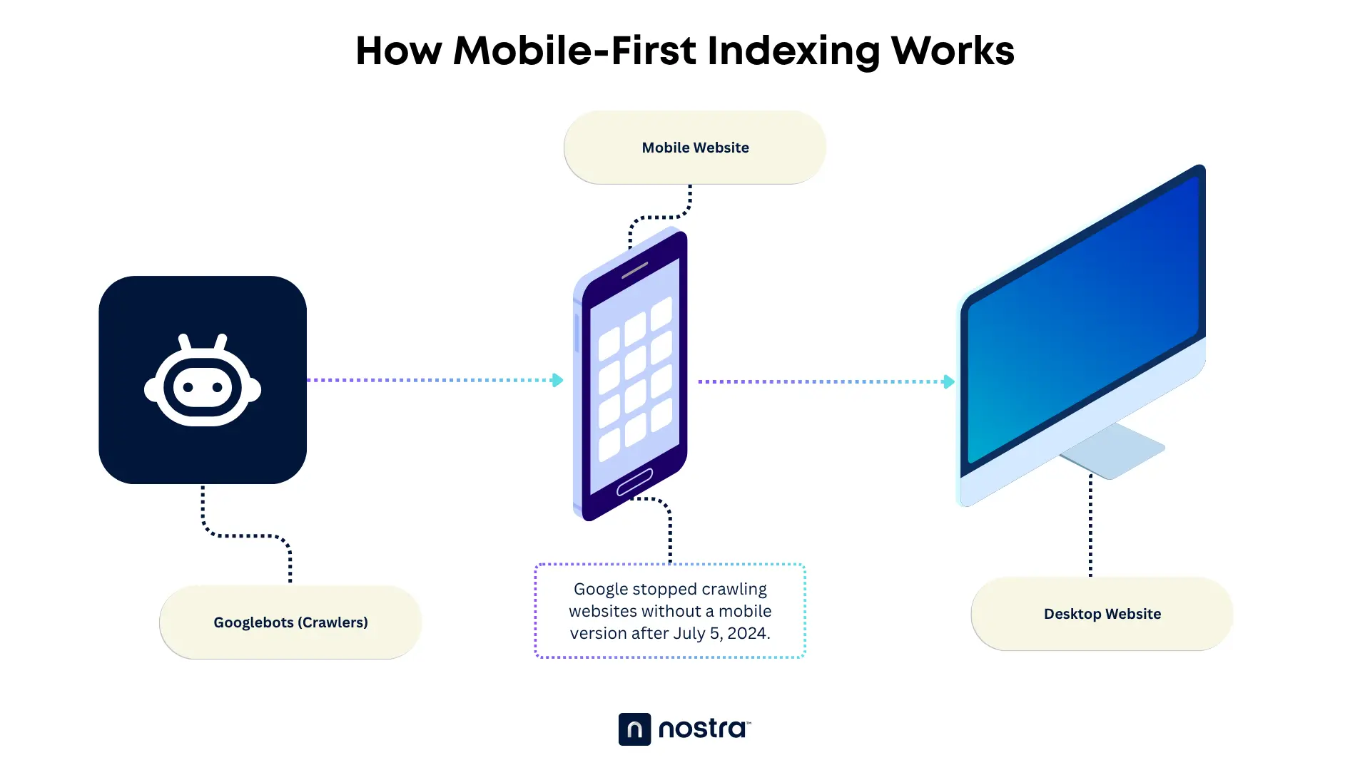
"Google predominantly uses the mobile version of a site's content, crawled with the smartphone agent, for indexing and ranking. This is called mobile-first indexing," — Google’s Definition.
Since 2016, Google has been steadily working towards implementing a complete mobile-first index. And now that we're a year past the July 2024 deadline, every website — regardless of age or niche — will now be evaluated by the mobile Googlebot first.
This ensures that each piece of content is indexed and ranked based primarily on what mobile users see. Moreover, ranking signals such as page titles, performance, and internal links will also be analyzed directly from the page's mobile version.
Of course, this doesn't mean your desktop-focused optimizations are rendered pointless. While Google does check your website's mobile version first, your desktop pages will still be factored in, especially when determining rankings for desktop search.
The Reason Behind the Switch
So, what's the reason behind this big change?
The first thing you need to understand is that every core Google update is designed for a single purpose: to improve the user experience (UX).
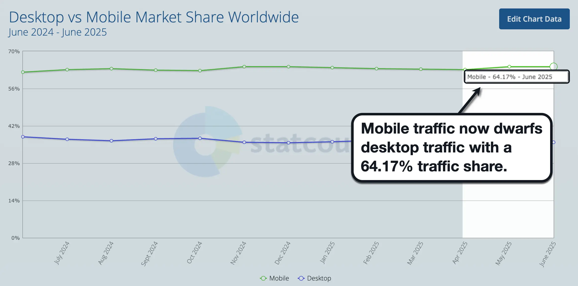
To accomplish this objective for the most users possible, it only makes sense for Google to prioritize website versions that cater to the most traffic.
According to recent data, 64.17% of worldwide internet traffic now comes from mobile (versus 35.83% from desktops.
Beyond search engine results, a recent 2022 study from Pew Research Center revealed that 76% of US adults prefer making online purchases through smartphones, showcasing the pervasive influence of mobile shopping.
All things considered, Google's push for mobile-first indexing is not only reasonable — it's also expected by those who understood the potential of mobile internet since the beginning.
Google’s Recommended Configurations
At this point, you're probably wondering how website owners should respond to Google's mobile-first search platform.
The good news is, Google has always been transparent about what it's looking for in terms of mobile-friendliness.
Let's start with the three recommended website configurations in Google's official documentation:
1. Responsive Design
In a nutshell, responsive design utilizes page elements that automatically adjust and repositions depending on the user's screen size. It serves the same HTML content through a single URL, which simplifies implementation, long-term maintenance, and on-page SEO.
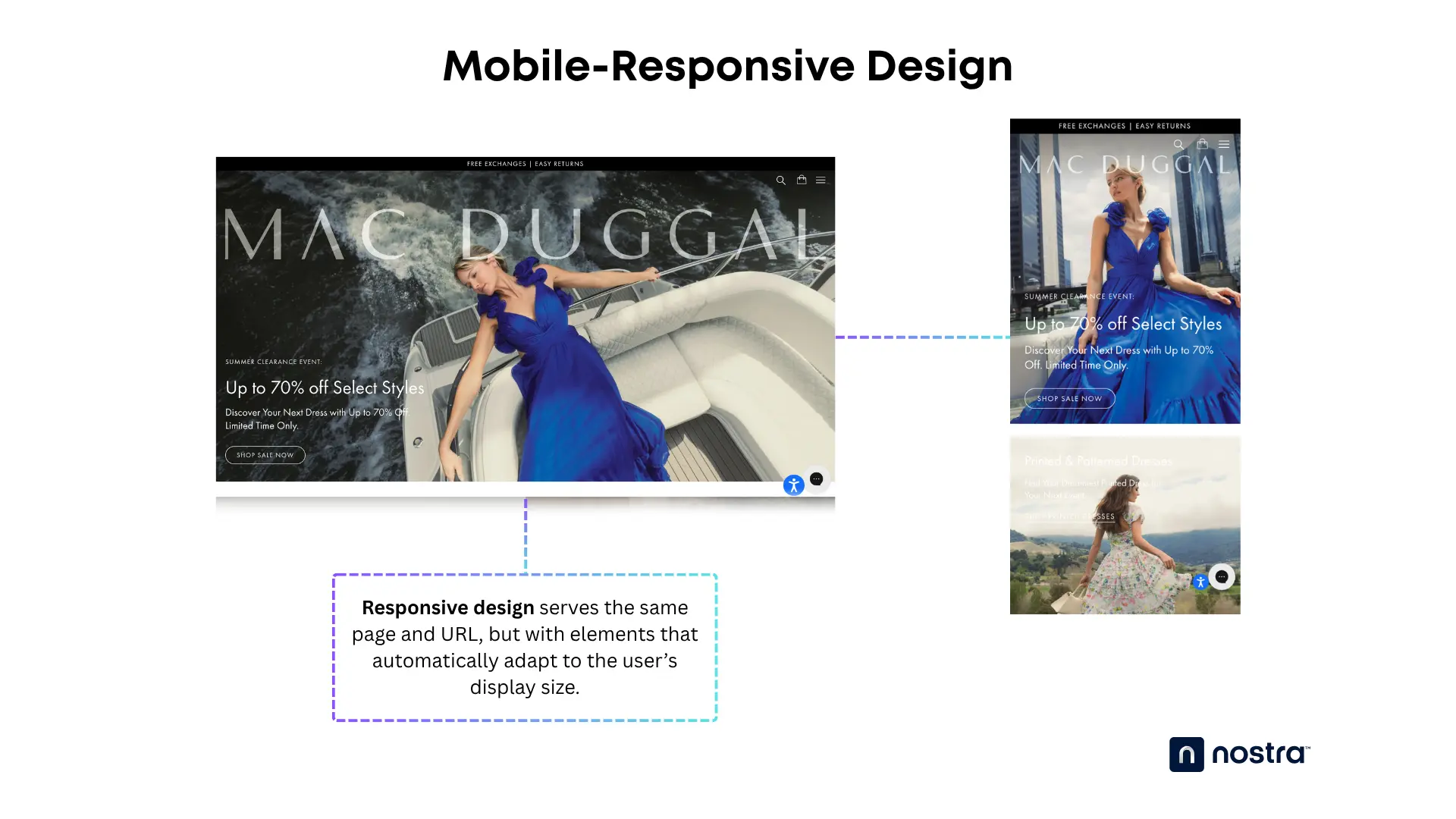
Apart from being easy to implement, well-coded responsive design can also adapt to any screen resolution or aspect ratio without manual configuration. That's why mainstream website platforms like Shopify and WordPress come with ready-to-use responsive themes right out of the box.
2. Dynamic Serving
Similar to responsive design, dynamic serving is another mobile optimization configuration that uses the same URL for all devices.
The key difference is, dynamic serving utilizes user-agent sniffing to identify the user's browser platform and deliver the appropriate, device-specific HTML file.
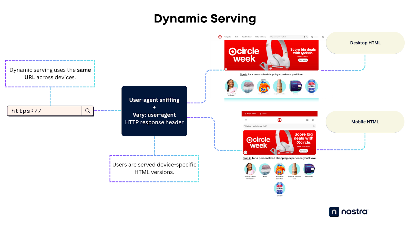
Dynamic serving enables deep customization and personalization based on the user's device. After all, users are accessing an entirely different HTML tailored to their device — not a similar HTML with responsive elements.
The downside is, dynamic serving relies on accurate user-agent detection for optimal performance. More importantly, it involves substantially more work since you have to build individual HTML files per device.
3. Separate URLs
Another approach to dynamic serving is to use separate URLs for device-specific HTML versions. This also relies on user-agent, Vary HTTP headers, or server-side client detection to identify the user's device and redirect them to the matching URL for their browser.
Let's say a user tries to access Facebook through a mobile browser.
Once the site detects that they're using a mobile device, they'll get redirected from "facebook.com" to "m.facebook.com" — an entirely different URL.
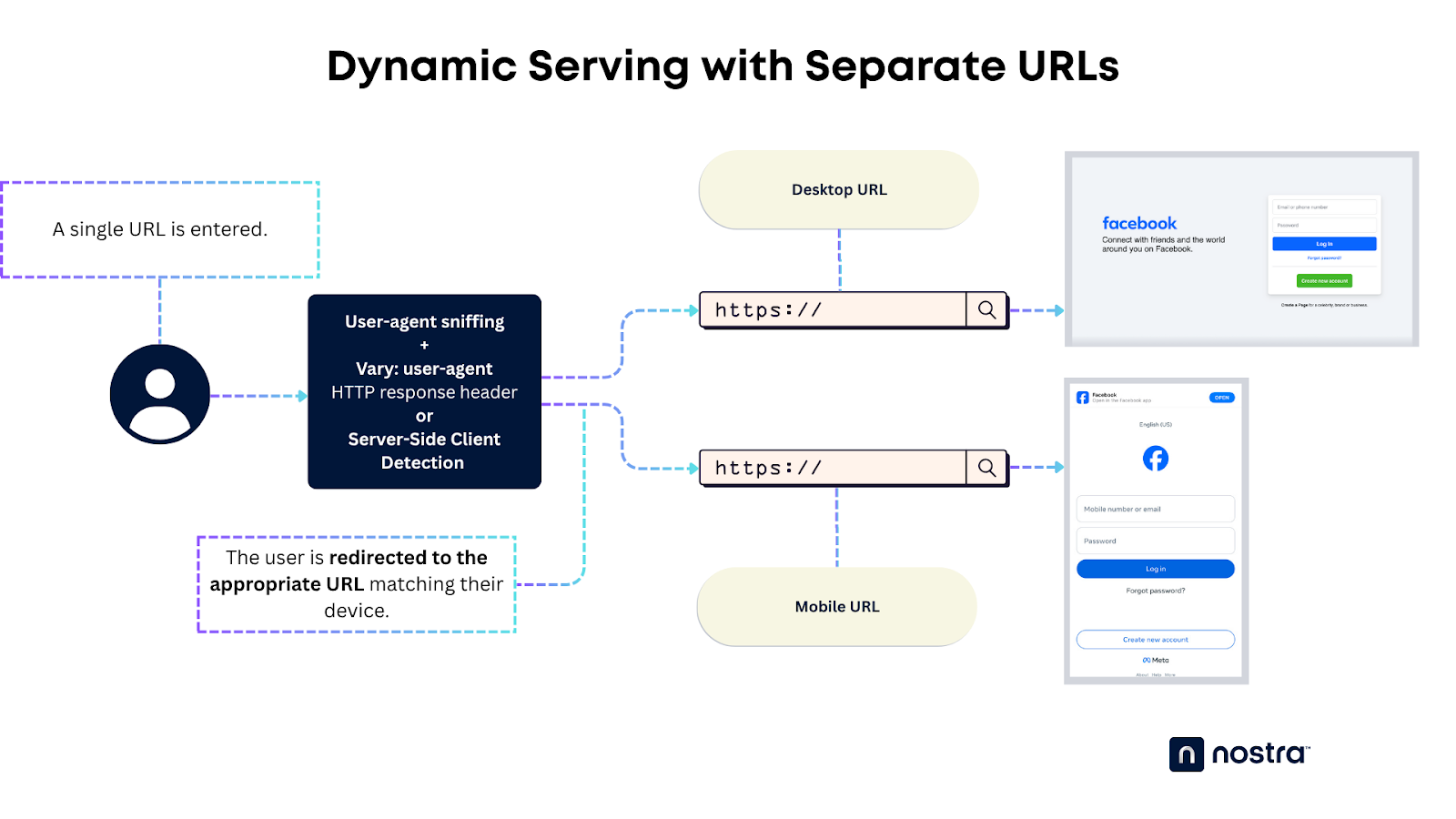
Using separate URLs for device-specific versions of your website also offers more in-depth customizability and SEO than responsive design. It also unlocks more opportunities for personalization.
However, dynamic serving with separate URLs requires way more technical knowledge and grunt work to pull off.
Important: While all three configurations contribute to a mobile-friendly site, it's essential to note that the guide's content primarily addresses dynamic serving and separate URL setups. In the case of responsive design, where content and metadata remain consistent across devices, the considerations differ.
SEO Best Practices for Google’s Mobile-First Indexing
Now that you understand the fundamentals of mobile-first indexing and the recommended configurations, let's explore the SEO best practices on the mobile-centric internet:
1. Consistent UX Across Devices
First and foremost, the user experience and user interface (UI) should be optimized for touchscreen displays.
While it should be consistent with your desktop website's design language and brand identity, you need to make a handful of adjustments to enhance the experience for mobile users.
Here's a checklist to get you started:
- Improve readability — Great readability is key when creating a satisfactory user experience on mobile. The rule of thumb is to use larger, readable fonts with sufficient whitespace to prevent the page from looking too busy.
- Increase the size of clickable elements — Enlarging clickable elements, be it menus or Call-To-Action (CTA) buttons, prevents accidental taps, which can be intensely frustrating for mobile users. Also, consider modifying page layouts to keep clickable buttons from being too close together.
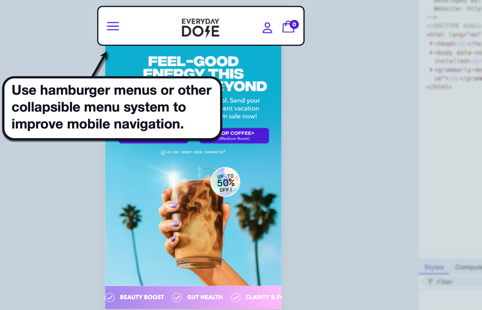
- Use mobile-optimized navigation — Most responsive websites automatically use collapsible menus (i.e., hamburger menu buttons), which offer a more seamless navigation experience for mobile devices. If you're using dynamic serving, you need to build the HTML structure, CSS styling, and JavaScript to create your collapsible menu from scratch.
Remember, it's not just about creating a great-looking experience on smaller screens. Reinforcing your website's accessibility on mobile positively impacts SEO ranking, user retention, conversion rates, and overall online success.
2. Mobile-Friendly Copy
For users, nothing is more infuriating than swiping, pinching, and tapping away at a website that severely lacks mobile optimization.
The struggle is exacerbated if your definition of website content is a thick, long wall of text — no transitions, visual breaks, subheadings, or whitespace to make your post more scannable.
Aside from avoiding these pitfalls, make sure your content itself is produced with mobile users in mind.
Here are some tips to remember:
- Use simple and readable fonts (avoid script fonts)
- Don't embed internal links into entire sentences — or put them too close together (to avoid accidental taps or clicks)
- Insert a "back-to-top" button or function for long-form content
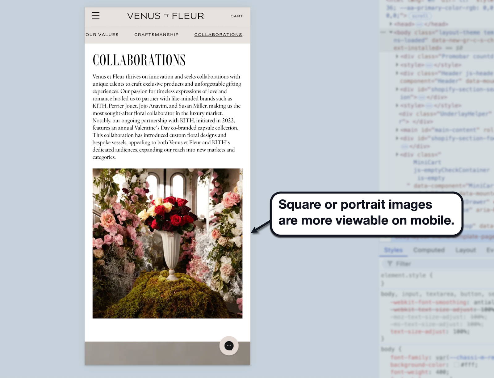
- When using images, use square or portrait aspect ratios (e.g., 9:16, 2:3, and 4:5) to make them more viewable
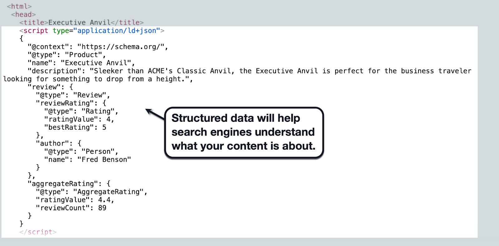
3. Structured Data Alignment
In the world of website development, structured data is like a blueprint that search engines can use to understand the nature of your content.
Some of the structured data markups used on websites today are:
- Article — For general articles like news updates, "how-to" guides, and listicles.
- Product — For product pages or listings with information like price, reviews, and availability.
- Recipe — For cooking recipes in food blogs and similar websites.
- FAQPage — For outlining questions and answers while optimizing your page for rich snippets and voice search results.
While it's technically fine to use different structured data types for different versions of your content, using the same markup across all versions is generally easier and better for SEO. The key is to make sure your markup communicates accurate information to Google, which could earn you a place in rich results.
4. Optimized Images and Videos
When it comes to website development, visual content such as videos, images, and custom graphics isn't just about aesthetics.
They help improve information retention for users, boost engagement rate, and enhance the emotional impact of your messaging. And, if with the right optimization tactics, these images can also elevate your search engine visibility.
For starters, consider using keyword-optimized filenames to help search engines understand the relevance and content of your images. It's also a widely accepted practice to use descriptive "alt text" tags, which are strings of text that appear whenever an image fails to load — helping users with visual impairments or poor internet connection.
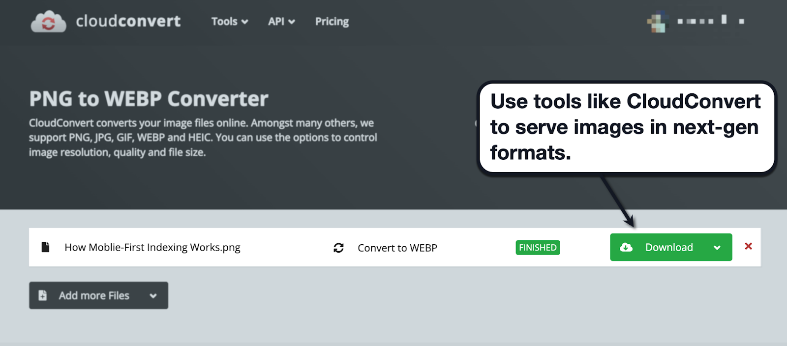
You should also consider serving images in next-gen formats, ensuring browser compatibility and preserving image quality while improving loading speed.
An easy way to do this is through tools like CloudConvert, which allows you to convert any image into any format en masse.
This takes us to the next mobile-first SEO best practice…
5. Page Speed Optimization:
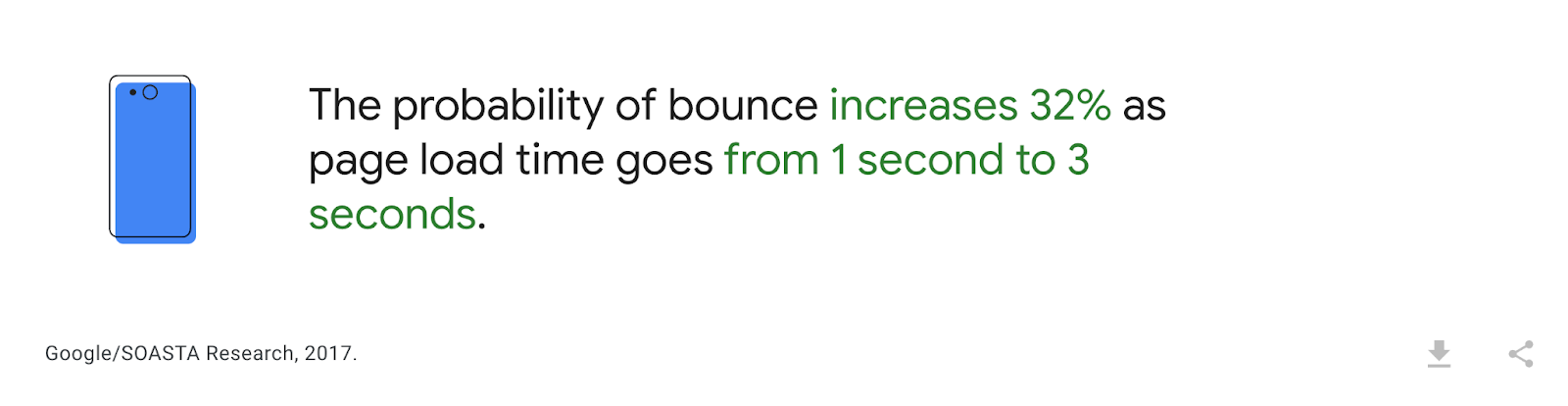
Website loading speed is a crucial part of the user experience, especially for mobile users who regularly rely on hotspots and mobile data.
Remember, a good chunk of users abandon a website that fails to load in three seconds or less. In fact, a two-second difference in loading time often translates to a 32% increase in bounce rate.
Page speed is also a known Google ranking factor — plus, a deciding factor when it comes to conversion rate.
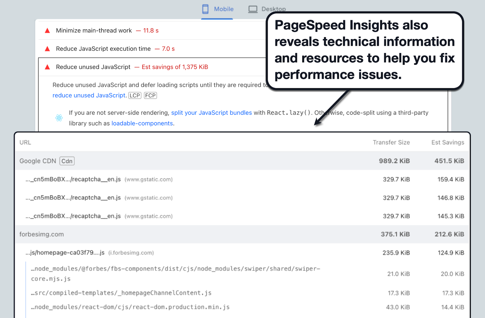
To get started with mobile performance optimization, run a diagnostics with a tool like PageSpeed Insights. Just enter your website's URL, click 'Analyze,' and make sure you're on the "Mobile" tab.
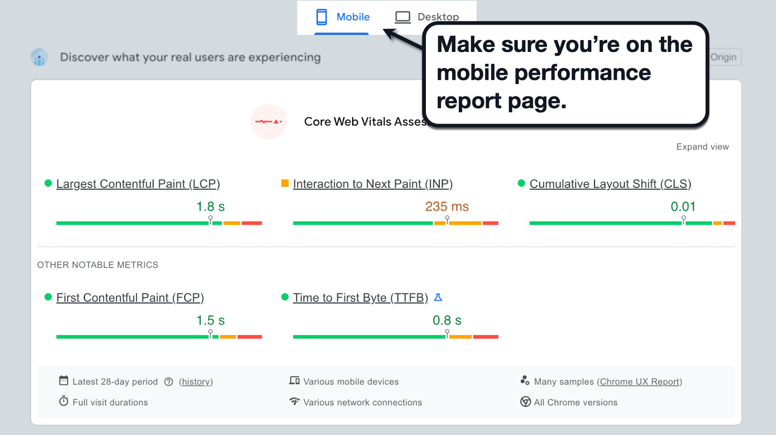
The first section of the report includes your mobile website's Core Web Vitals metrics, namely:
- Largest Contentful Paint (LCP) — How long it takes to load the largest section or element on the page.
- Interaction to Next Paint (INP) — How long it takes for a browser to get a response from the moment of user input.
- Cumulative Layout Shift (CLS) — How much of your website's layout shifts as new content or elements load in.
These metrics not only gauge your website's loading speed, but also its stability, responsiveness, and how they translate to real-world UX.
For more straightforward optimization recommendations, scroll down to the "Diagnose performance issues" section for a list of specific issues detected on your website or page.
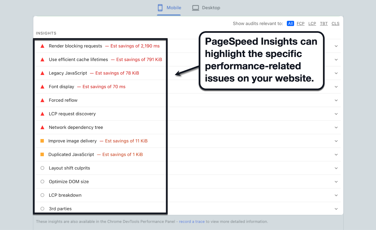
As a bonus, PageSpeed Insights also includes actionable resources and links to help you address the problem. Just click on any listed issue to reveal the information you need.
Looking for a turnkey solution that can deliver substantial impact with little to no work?
By leveraging our Edge Delivery Engine, Nostra AI builds beyond the capabilities of traditional Content Delivery Networks (CDNs) with smart caching for both dynamic and static content — speeding up websites by an average of 20-30%. If you're eager to explore further about enhancing site speed and discovering effective improvement methods, book a free demo with us.
6. Monitor for Indexing Issues
If your website is new, there are a few steps you need to take in order to kickstart the crawling and indexing process.
For one, you need to submit your website's sitemap to Google — a file that compiles all the pages and URLs you want indexed.
Google Search Console has a simple sitemap submission tool you can use to expedite the indexation process.
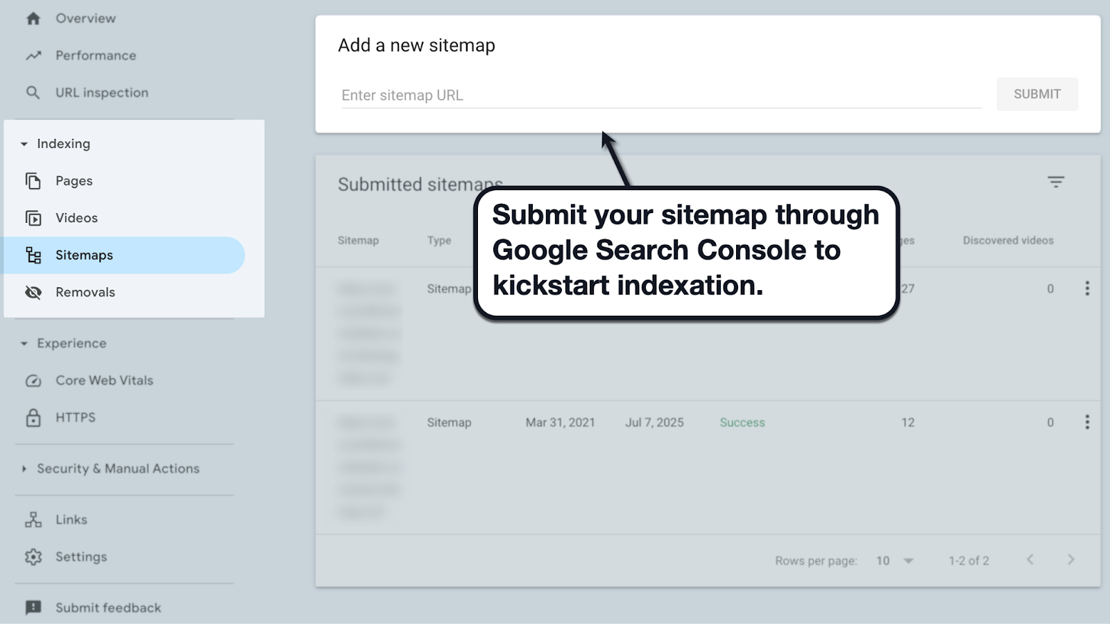
Here are other Google Search Console features worth checking out for mobile-first SEO:
- Find indexing issues — Search Console scans your website for problems that impede the crawling and indexing processes.
- Track SEO metrics — Monitor clicks, track impressions, and even compare performance across devices (e.g., desktop, mobile, and tablet).
- Identify security issues — Scan your domain for hacked content, malware, and other threats that can destroy your website's reputation and rank-worthiness in the eyes of Google.
Must-Read: How to Optimize Your Website for Mobile Devices
What Does Mobile-First Indexing Mean for SEO?
At the end of the day, mobile-first indexing is just another step for Google to find ways to improve the experience of as many users as possible.
It's still about providing top-quality content, targeting the right keywords, and optimizing your website's performance — but with more prioritization for mobile users over that of desktops.
Additionally, take note that certain metrics, such as scroll depth and click-through rates, may vary between mobile and desktop versions of pages. This underscores the need for a thorough optimization strategies that factor in device-specific user behavior.
Not sure what to do next?
For non-technical website owners or startup founders, a practical approach is to look for a website technical optimization agency or company.
We also strongly recommend booking a free demo here at Nostra AI to discover how industry-leading edge delivery can take website performance to the next level.


