.svg)
.svg)
.svg)
.svg)
Whether you like it or not, the future of SEO is mobile.
It doesn't matter if you're an ecommerce store, blogger, agency, or local business. If you're looking to grow your online presence or position your brand as a top contender in your industry, you need to prioritize where most of your online customers are.
And that happens to be on mobile devices.
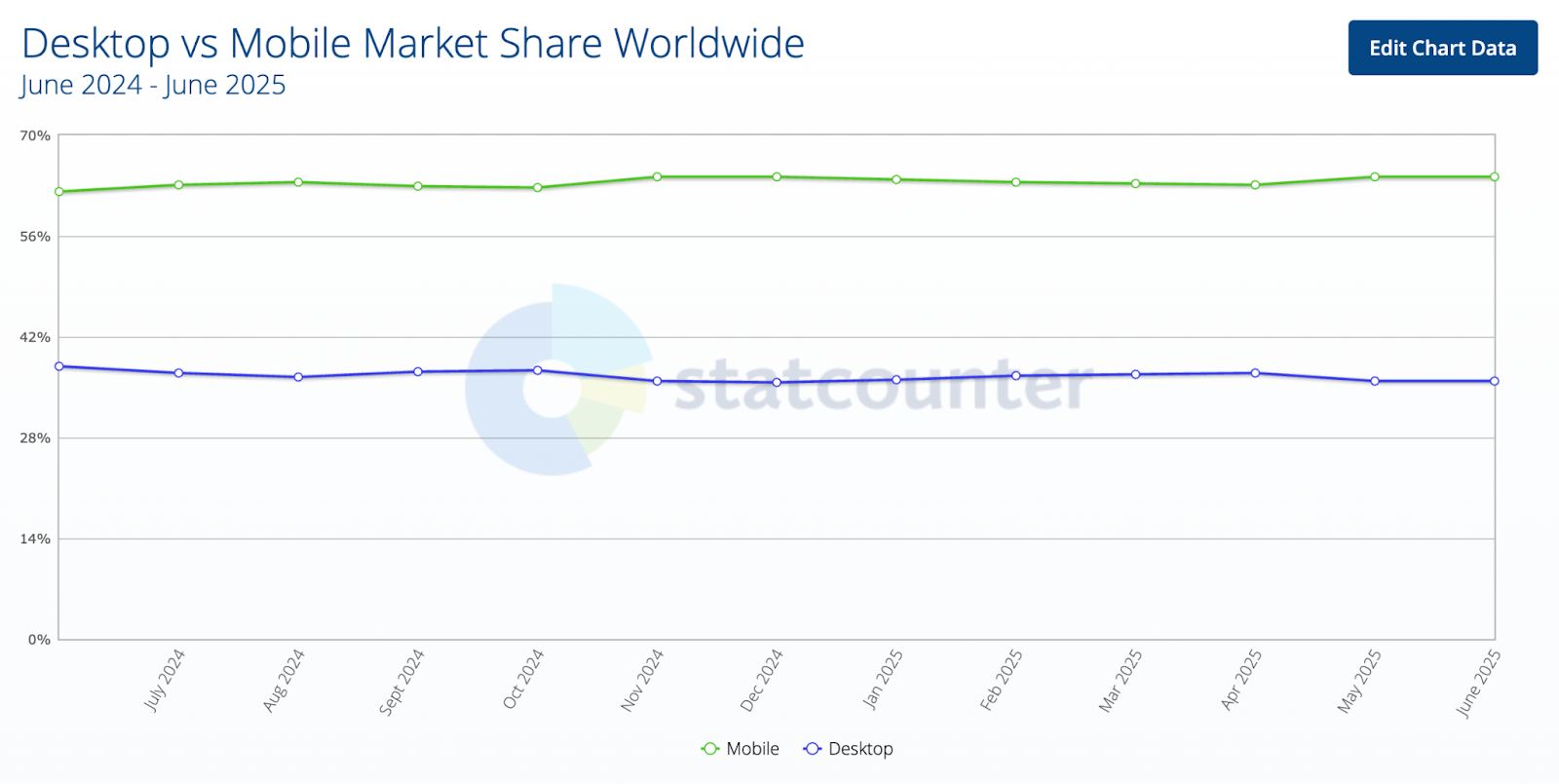
As of June 2025, mobile has a staggering online traffic share of 64.35% — up from 62.08% in 2024.
Impressive, right?
Remember, it's not just about browsing habits. In fact, the majority of users also do their online shopping on mobile.
Data from Cropink reveals that mobile traffic will account for 75% of all ecommerce sales this 2025. In addition, the mobile ecommerce market is on track to reach a whopping $6.5 trillion in the same year.
To help you get your slice of this pie, this post will walk you through the top Mobile SEO strategies that every brand should use.
Let's dive in.
1. Optimizing for Mobile-First Indexing
It's been a year since mobile-first indexing became the norm.
TL;DR, mobile-first indexing is an initiative where Google looks at a website's mobile version first before evaluating its desktop performance.
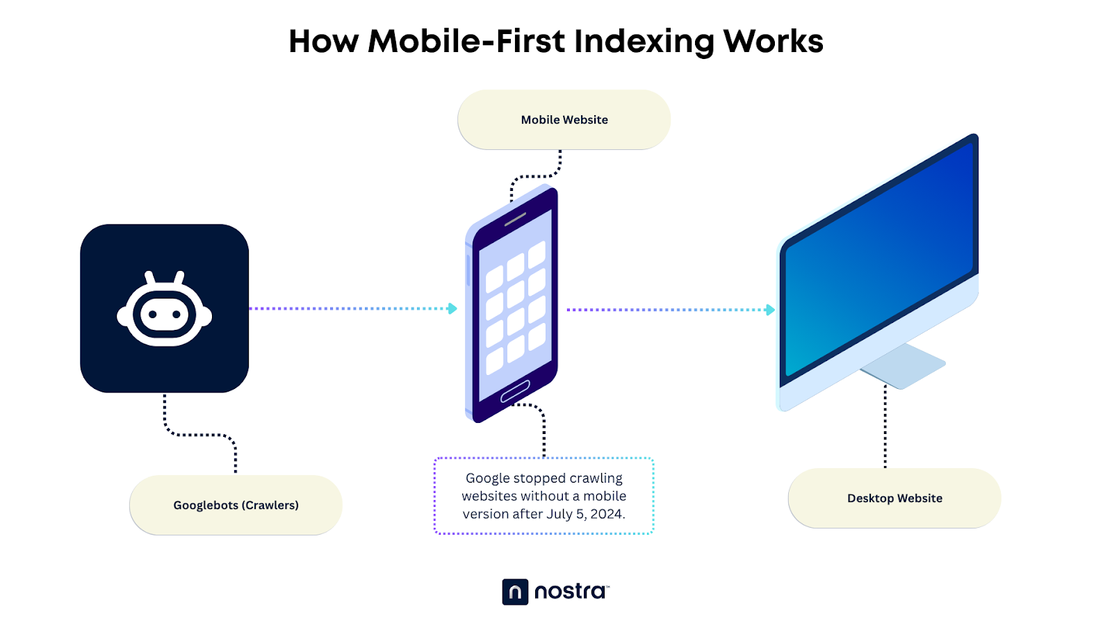
Mobile-first indexing is a response to the massive increase in mobile internet users and worldwide adoption of 5G technology.
To optimize for mobile-first indexing, there are three things every website owner needs to focus on:
Mobile-Friendly Design
Just because your desktop website is top-tier doesn't mean the mobile version will provide the same experience.
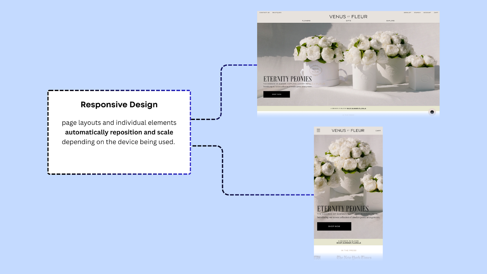
A practical way to ensure a consistent user experience across devices is to implement responsive design. This serves the same HTML file for desktop and mobile users — but with a catch.
With responsive design, the page's layout and elements automatically adjust depending on the user's display size. This keeps content readable, accessible, and easy to navigate regardless of device screen specifications — be it on a tablet, laptop, or smartphone.
The good news is, modern page builders and ecommerce platforms come with customizable responsive themes right out of the box. All you need to do is make a few tweaks to get this checked off your list.
Meaningful Content
No matter how you slice it, publishing high-quality, meaningful content is a key ingredient to SEO success — before and after mobile-first indexing.
However, minor adjustments to your content strategy should be explored.
Keep in mind that mobile users have very different content consumption habits and preferences from desktop users.
To accommodate smaller screens and touchscreen interfaces, you need to avoid content with immense walls of text. Get straight to the point and use a strategic blend of concise paragraphs, visuals, and various formatting options (e.g., bullet points, numbered lists, and tables).
2. Adapting to Voice Search
As virtual assistants like Siri and Google Assistant improve over the years, more and more people rely on voice-activated search for routine tasks like scheduling appointments and searching for information online.
After all, it is undeniably more convenient to verbally ask questions than type with a mobile keyboard.
Think with Google revealed that 27% of users globally run voice searches on mobile.

While it's far from the majority, that's still a considerable chunk of traffic. And, if you're serious about dominating the mobile search space, you'll need all the advantage you can get.
Embrace Natural Language Processing (NLP)
Voice recognition and Natural Language Processing (NLP) go hand in hand.
As voice recognition software effectively translates verbal inputs into text, NLP aims to understand the context and user intent behind it. These complementary technologies essentially enable devices to accept spoken language as commands to execute tasks, such as conducting an online search.
In practice, this means targeting question-based and conversational, long-tail queries. These should be easy to spot with tools like Semrush.
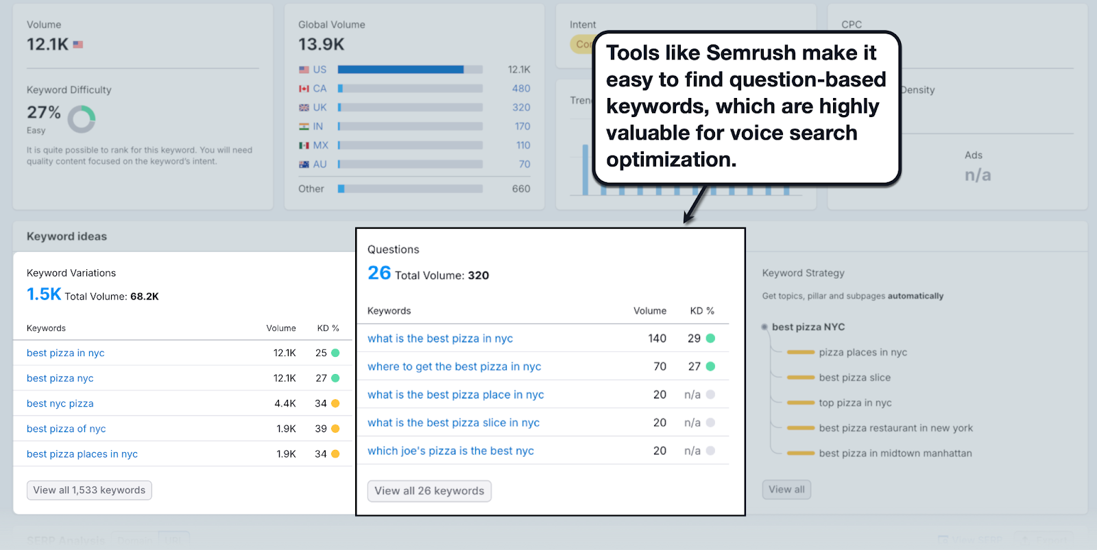
Picture this: Instead of typing a query like "best pizza NYC," a voice search user might ask, "What's a good pizza place in NYC?"
These are two very different search keywords — but the user intent remains the same. As such, optimizing for both keywords is definitely a must for mobile SEO.
Nail the Featured Snippets
In general, voice search results usually pull content from Google's featured snippets, primarily:
- FAQ snippet (People Also Ask)
- Paragraph snippet
- List snippet
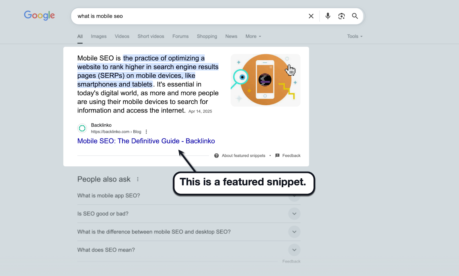
To optimize for rich snippets, especially in line with mobile SEO, you need to directly address the users' questions. Write short, precise sentences — somewhere between 40 and 50 words, as suggested by SEO giants like Moz and Semrush.
Also, use clear formatting styles like bullet points and tables. Google loves information that's formatted for readability, especially when it comes to featured snippets.
3. Improving Mobile Page Speed for SEO
If loading speed is important for desktop users, it is even more so for mobile users.
Remember, these people surf the web through mobile hotspots and free WiFi. To preserve your website's usability, you need to go all-in on your performance optimization efforts, especially since Google expressly states that page speed is an important mobile search ranking factor.
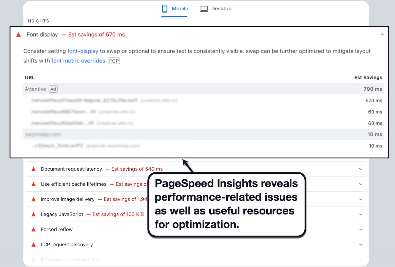
We recommend using PageSpeed Insights to detect performance-related issues on your website as well as gain access to actionable resources. Just be sure to check the 'Mobile' report if you're looking specifically for mobile optimization suggestions.
Pro Tip: Looking to give your website's performance a major boost without spending weeks on optimizations? Consider turnkey solutions like Nostra AI's Edge Delivery Engine, which can help you achieve near-instant loading speeds with just 30 minutes of setup time!
To kickstart your performance optimization efforts, let's take a closer look at a few things:
Minimize HTTP Requests
From a technical perspective, users and websites communicate via HTTP requests.
Think of these as requests or instructions from users, asking the server to complete specific tasks like retrieving content or submitting information.
The more HTTP requests, the longer it takes for a website to load. This also applies if you have needlessly large files on your website, which leads to longer requests.
Here are three essential things you can do to minimize the impact of HTTP requests on page performance:
- Optimize your code — Consider merging small but essential JavaScript and CSS files with a tool like NitroPack. Also, look into code optimization strategies that reduce your website's Total Blocking Time (TBT), like minifying JavaScript, implementing asynchronous loading, and code splitting.
- Enable client-side caching — Caching works by storing frequently-accessed website data (e.g., images and stylesheets) in a temporary location for quicker load times. With client-side caching, website files are stored in the user's browser cache directory, which is right in their system.
- Build a lean website — Plenty of no-code and low-code platforms like WordPress and Shopify allow non-technical users to effortlessly expand their website ecosystem through ready-to-use plugins or extensions. To make sure you're not sabotaging your own website's performance, make it a habit to review your plugins, delete the ones you no longer need, and avoid relying too much on even more add-ons in the future.
Optimize Images
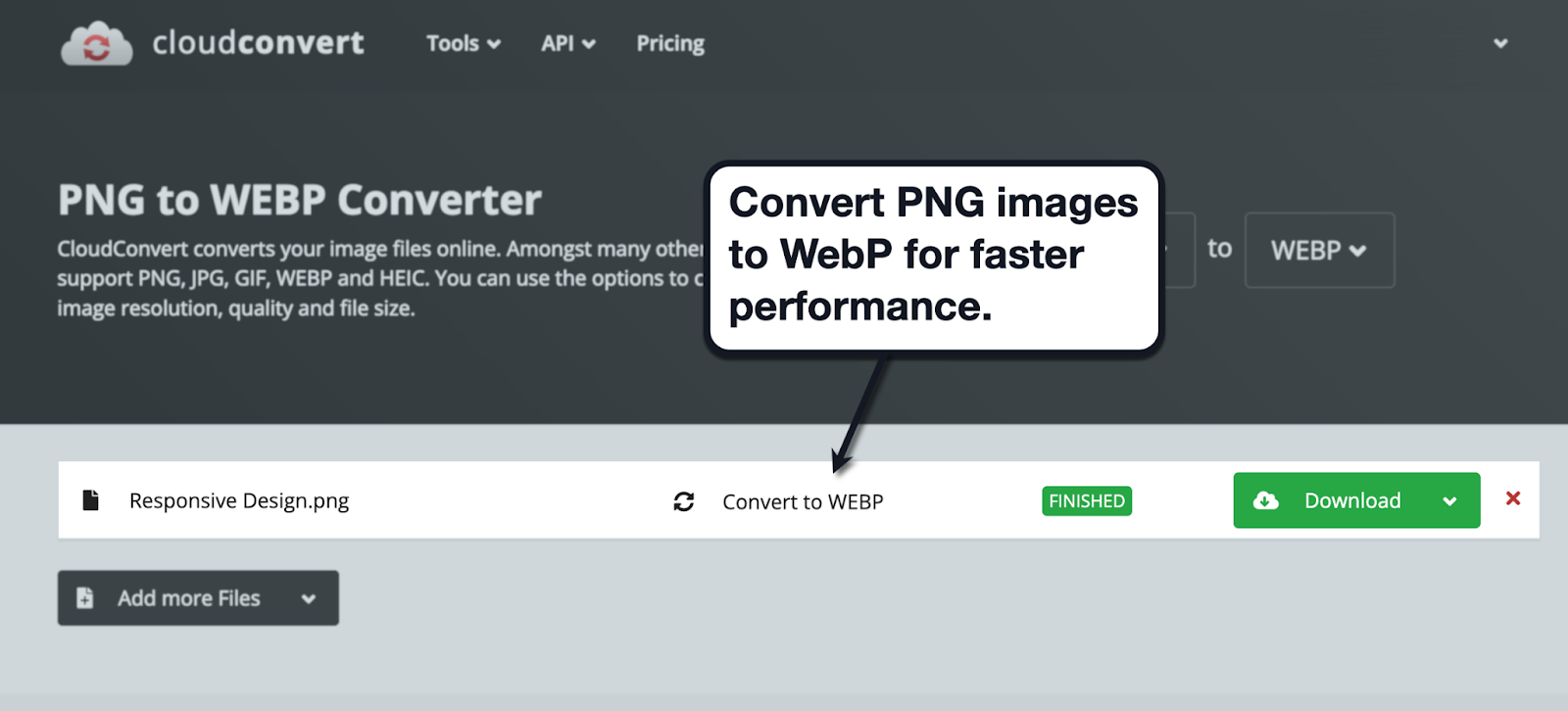
Although high-quality images play a crucial role in creating engaging user experiences, they can bog down your website without proper optimization.
There are a plethora of ways to optimize images for faster loading without affecting quality. For one, you can use tools like CloudConvert to serve them in a next-gen, web-friendly format like WebP.
You can also automate this process using one-and-done solutions that are specifically designed for your platform.
For example, if you use WordPress, use automated image optimization plugins like ShortPixel.

Consider a Site Speed Optimization Company
Speaking of automated, working with a website speed optimization company is pretty much guaranteed to fix all your performance-related problems — assuming, of course, you choose the right provider.
Here's a tip: Go with an agency or platform that understands SEO best practices so you're not just blindly chasing after faster load times. You're also implementing optimizations that can boost your website's rankings in organic search results.
Nostra AI, for example, offers the proprietary Edge Delivery Engine, which is powered by smart caching, reverse proxies, and a strategically distributed network of 300+ edge servers. See it in action by booking a demo here!
4. Understanding Core Web Vitals
A fast loading speed may be a prerequisite to a great user experience, but it doesn't paint the full picture by itself.
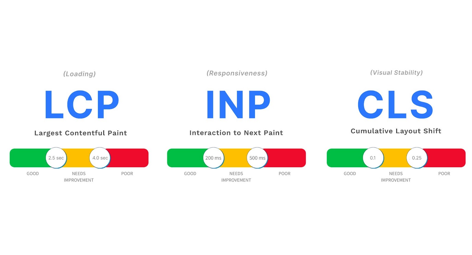
To fully grasp what the experience looks like for your audience, a better strategy is to track your Core Web Vitals metrics, namely:
- Largest Contentful Paint (LCP)
- Interaction to Next Paint (INP)
- Cumulative Layout Shift (CLS)
The best way to track your Core Web Vitals (as well as identify improvement opportunities) is to either use PageSpeed Insights or Lighthouse.
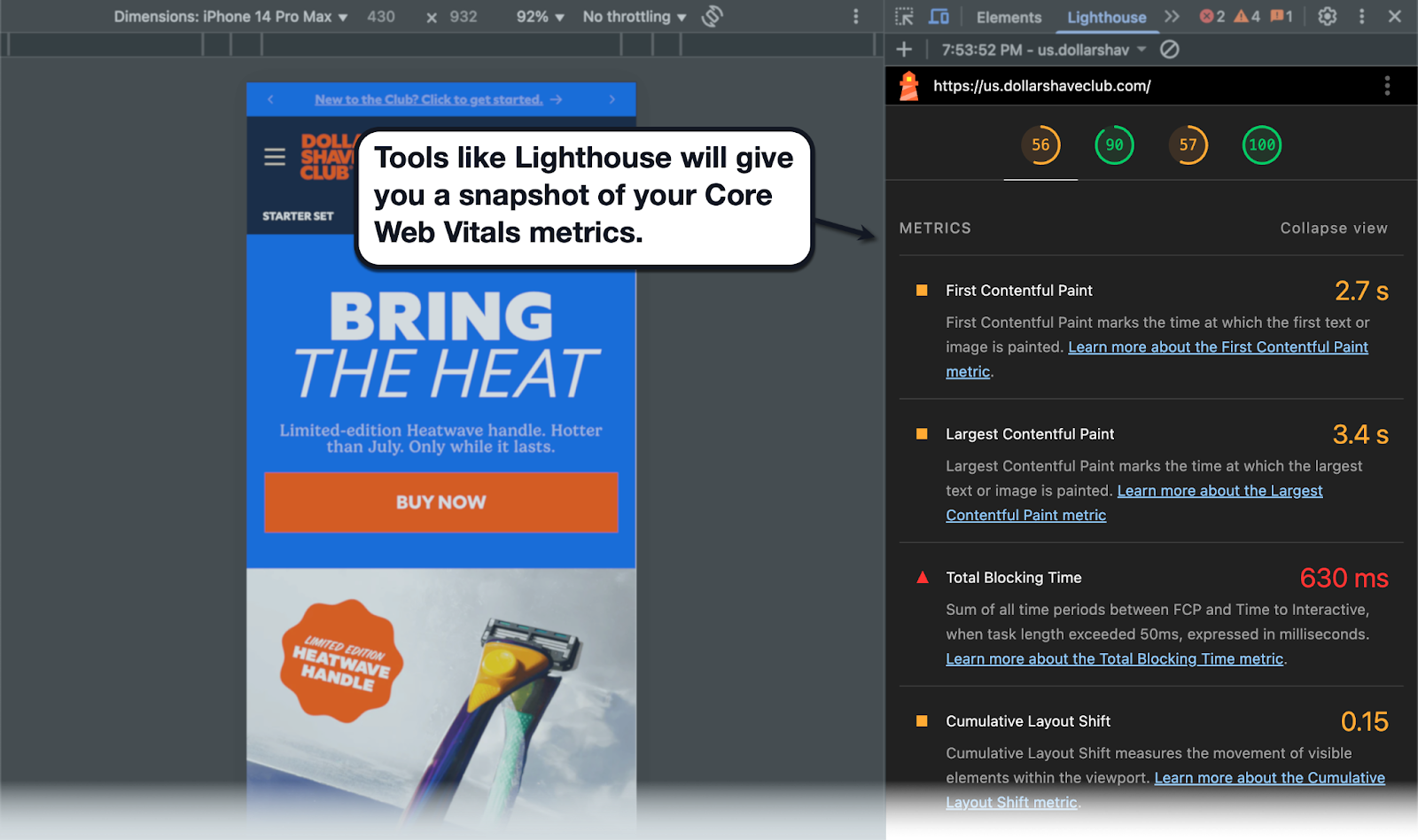
How to tell if your website has good Core Web Vitals?
To give you straightforward objectives, here are the ideal values for each Core Web Vitals metric:
- LCP — 2.5 seconds or faster (4 seconds or more is considered bad)
- INP — 200 ms or faster (500 ms or longer is considered slow)
- CLS — A rating of 0.1 (0.25 means unstable)
Optimizing LCP
LCP measures how long it takes to finish loading the biggest element or content section on your page. This can be optimized using multiple page speed optimization tactics, like removing render-blocking JavaScript, upgrading your web hosting, and using a Content Delivery Network (CDN).
Optimizing INP
INP tracks the longest delay between a user interaction (e.g., mouse click, tap, or keypress) and the next frame. You'll need more advanced tactics to optimize this, including server-side rendering, code optimization, and preloading critical assets using the rel="preload" attribute.
Optimizing CLS
Lastly, CLS measures the biggest layout shift (unexpected movement of page elements) in terms of impact and distance. You can minimize CLS by adding size attributes for visual assets, using min-height to reserve spaces for dynamic elements, and using the contain CSS property to set boundaries for sections.
Keep in mind that SEO is an ongoing process — not a one-time task. Remaining vigilant about your Core Web Vitals will pave a more certain path to SEO success.
Nostra AI elevates your Core Web Vitals, resulting in improved conversion rates (CVR) and cost-per-click (CPC).
5. Embracing Video Content
It comes as no surprise that video currently dominates the mobile content sphere in terms of user engagement.
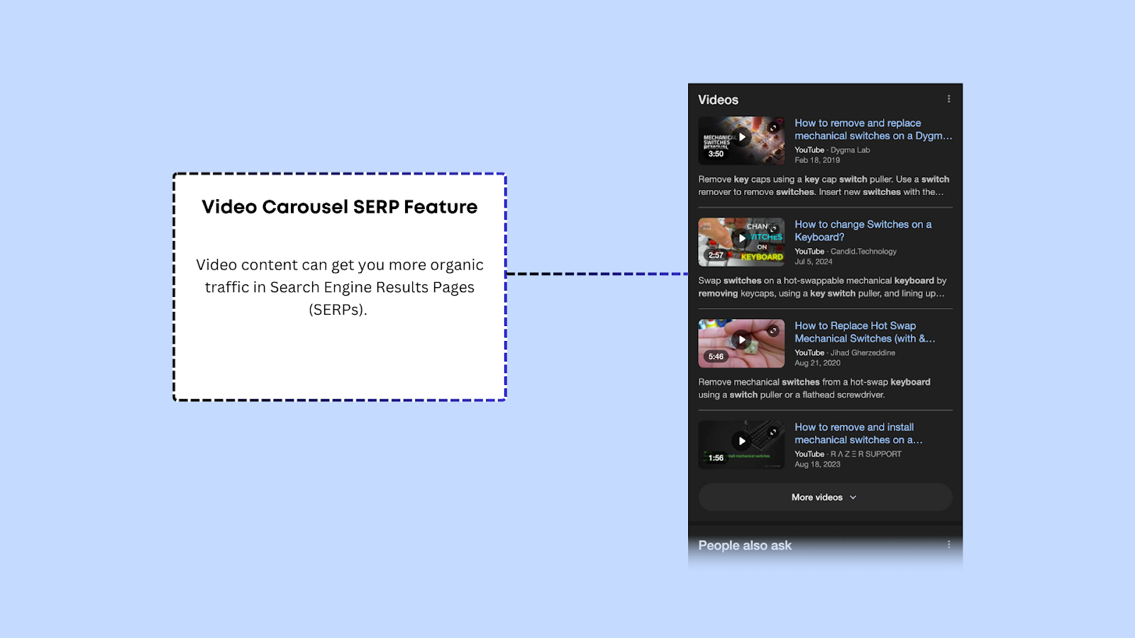
By optimizing metrics like session duration (time on site), click-through rate, bounce rate, and conversion rate, video content sends quality signals to Google that will improve your mobile SEO. Videos published on YouTube also get boosted in search results via the video carousel SERP feature.
In addition, video content done right can spread like wildfire across social media channels like Facebook and Instagram. This further increases user engagement while exposing your content to potential link sources, like bloggers, influencers, thought leaders, and other brands.
All that said, here are a few tips to help you leverage video content effectively:
Optimize Video Thumbnails
Video thumbnails, be it on YouTube, TikTok, or Instagram, are in charge of piquing the audience's interest and generating clicks.
Instead of using random snapshots from your clip, consider creating custom thumbnails with tools like Canva, which comes with a drag-and-drop graphic editor and professional-looking templates.
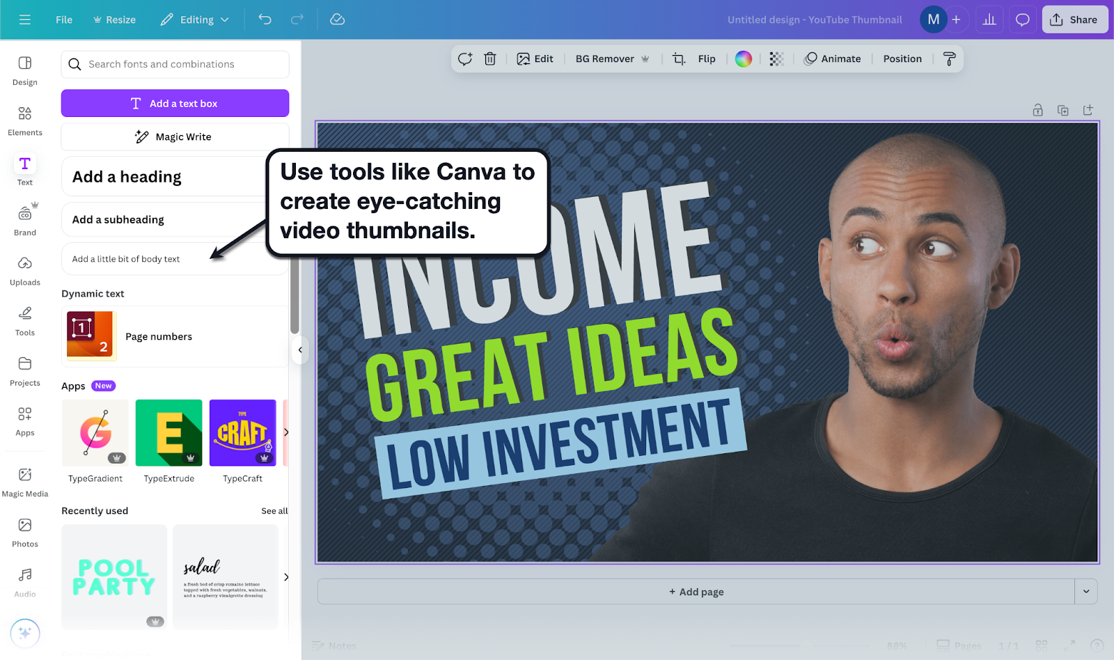
Below are a few pointers:
- Use headlines that convey the value your video content offers
- Utilize consistent branding in terms of color schemes and typography
- Conduct A/B testing to improve your thumbnail strategy over time
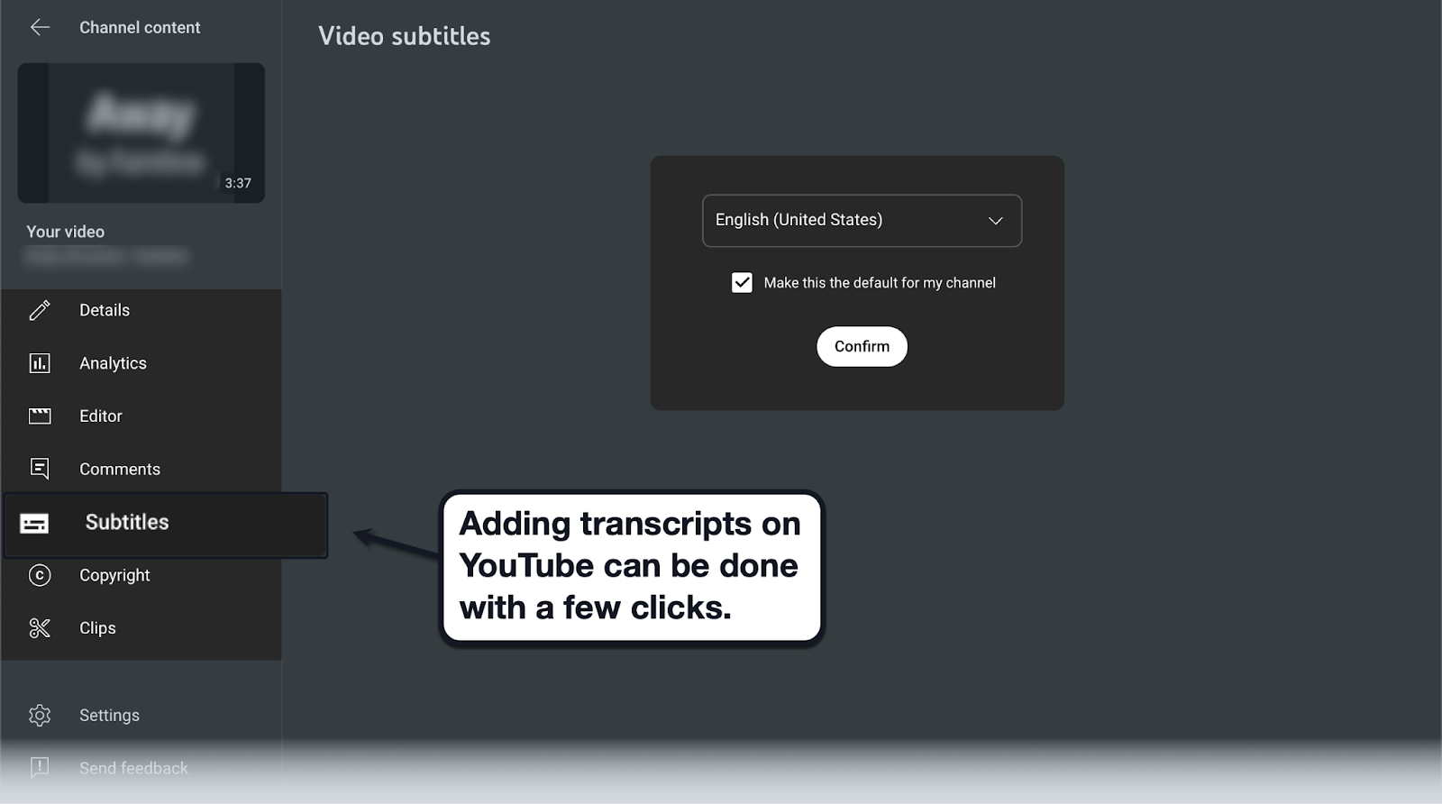
Work on Video Transcripts
Beyond hashtags and descriptions, transcripts allow search engines to understand the context behind video content.
After all, they're a great place to include target keywords that let you reach your intended audience.
Enabling transcripts also improves the accessibility of your videos for certain viewers. This further increases user engagement as well as your video's rankings in Google's video carousel.
To enable transcripts, simply enable the subtitles feature on your YouTube video and pick the right language.
Choose the Most Suitable Platform for Your Videos
Finally, consider where you want to host your videos.
You can upload them directly to your website, on YouTube, or via other platforms like Instagram and TikTok.
Here's a quick look at each platform to help you decide:
- YouTube — The obvious choice. Uploading your videos to YouTube would still allow you to embed them on your site while you take advantage of its large user base and mobile SEO potential.
- Self-hosted — Publishing videos directly through your web hosting service may offer advantages in terms of control. However, this may result in slower load times and relatively lower views (since you're relying mostly on your website's existing traffic).
- Short-form video platforms — Visual-content-centric platforms like TikTok, Instagram Reels, and Facebook. These offer convenient video editing features like stickers, hashtags, location tags, and built-in audience engagement tools.
6. Optimizing with Schema Markup
In simple terms, schema markups are snippets of code that describe your content in a way that search engine crawlers easily understand. And using them well can dramatically boost your visibility in both mobile and desktop search.
How To Implement Schema Markup
Implementing schema markup might seem intimidating, but there are several tools and guides available to assist you.
Google’s Structured Data Markup Helper, for example, will walk you through the process of generating schema markups for your websites. Simply enter your desired markup type, page URL, and use the visual editor to manually tag data.

Examples of Schema Markup for Mobile SEO
While there are numerous types of schema markups you can use, some are most effective for Mobile SEO. These include:
- Product Markup — Ideal for eCommerce websites, product markups can include product ratings, price, and availability status, all of which can be especially attractive to mobile users shopping on the go.
- Local Business Markup — For local businesses, marking up your local business listing can help your company stand out in local search results, and is particularly useful for mobile users conducting “near me” searches.
- Article Markup — For content-heavy sites, using an article markup can help search engines understand your content’s context, contributing to improved visibility in the search results.
7. Optimizing for Micro-Moments: The New Mobile Behavior
Never heard of micro-moments?
Coined by Google, a micro-moment is a fleeting instance whenever a consumer reaches for their device to fulfill a sudden urge to look for information.
Micro-moments are best identified by these characteristics:
- Quick, focused interaction(s)
- Clear user intent
- Action-oriented (to learn information, make a purchase, download a resource, etc.)
- Short-term
To leverage micro-moments for mobile SEO, you need to understand what they are first.
Identifying the Key Micro-Moments
In a mobile-driven world dominated by instant gratification, Google has identified four kinds of micro-moments:
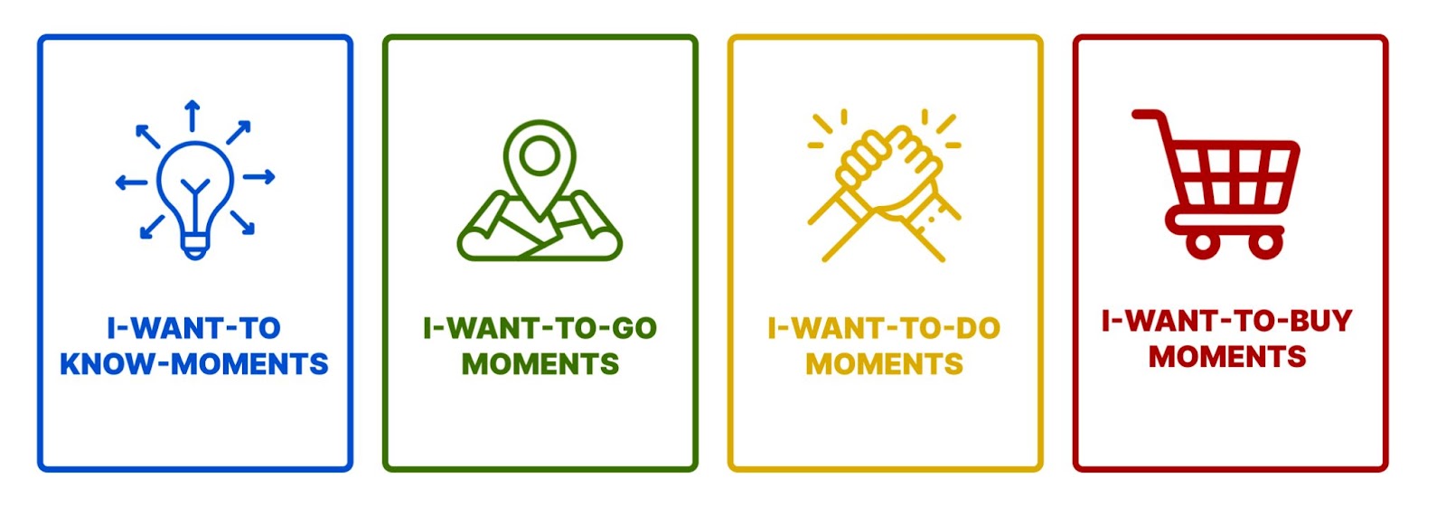
- "I-Want-To-Know" Moments — When a user is intently searching for a specific piece of information without any desire to make a purchase or take any further action.
- "I-Want-To-Go" Moments — When a user is strongly considering traveling to a specific location (e.g., shopping mall, grocery store, or restaurant).
- "I-Want-To-Do" Moments — When a user is searching for action-oriented resources to help them accomplish something (without necessarily buying a new product).
- "I-Want-To-Buy" Moments — When a user is in a shopping mode and determined to make a purchase.
Recognizing these micro-moments is the first step to delivering content experiences tailored to the user's intent. This results in better engagement and higher ranking potential for your website.
Optimizing Content for Micro-Moments
Remember, leveraging micro-moments is all about providing the right content at the right time.
Understanding keyword search intent is a great place to start.
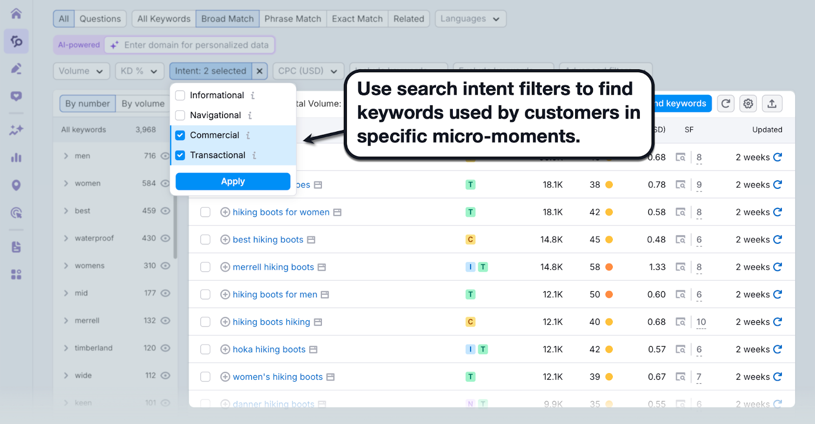
Use Relevant Keywords
If you know a thing or two about SEO, you may notice that micro-moments align with the different types of keyword intent.
"I-want-to-know" moments, for instance, can be identified with informational keywords — keywords that people use when searching for information online.
Action-oriented micro-moments like "I-want-to-buy" and "I-want-to-do" moments, on the other hand, often use transactional and commercial keywords. These are keywords used by searchers when they're close to a purchase decision.
Use tools like Semrush to research and filter keywords based on intent.
Consider User Journey
After understanding intent, it's also important to analyze the customer journey when optimizing for micro-moments.
Suppose you have two customers having an "I-want-to-buy" moment — a repeat customer and someone discovering your brand for the first time.
Even though they have the same intent, they may still respond differently to your content.
A repeat customer, for example, may appreciate add-on products and special "birthday" discount offers. Whereas a brand new customer may prefer a complete landing page with all the information they need to succeed with your product.
This takes us to the next step…
Create Engaging and Easy-To-Read Content
Next up, you need to optimize the right pieces of content that align with the user intent and customer journey.
The key here is to build content that's concise, skimmable, and easy to comprehend.
After all, micro-moments don't last very long. Might as well give your audience the exact information they need fast — before they lose interest.
Optimize for Local Searches
Finally, optimizing for "I-want-to-go" micro-moments means targeting local searches.
These are for businesses with a physical location that depend on foot traffic.
Here's a quick rundown of some of the best local SEO tactics:
- Claim your Google Business Profile — Set up and verify your business in Google Business Profile. This will help your website show up in apps like Google Maps and SERP features.
- Target local keywords — Target location-specific keywords relevant to your business location (i.e., digital marketing agency NY).
- Discuss local topics — Attract even more people with similar interests as previous customers by publishing about local events or trends.
In the highly dynamic world of Mobile SEO, understanding and optimizing for micro-moments can give you a distinct edge over your competitors. It helps align your strategy with real-time user needs, ultimately leading to higher visibility and better Mobile SEO performance.
Moving Forward
From embracing critical practices like ensuring responsive design and improving page speed, to staying ahead of trends like voice search and embracing video content, each aspect plays a vital role in ensuring your website is optimized for mobile users.
Furthermore, Core Web Vitals, micro-moments, and schema markups can offer your website the edge it needs in the competitive digital space.
The future of Mobile SEO may seem intricate and daunting, but by keeping up with these Mobile SEO best practices, you'll be well-equipped to navigate the mobile-first world of 2024. Embracing change and continually fine-tuning your strategy will not only improve your website’s visibility but also help in building lasting relationships with users. Ultimately, it's a journey of persistence, adaptation, and understanding the needs of your users.


