A good landing page experience has ten attributes. The page matches the ad that earned the click, pushes one goal, states its value in the headline, loads fast, works on a phone, offers original content, earns trust, asks for little, runs without bugs, and counts only real visitors. If you run Google Ads, start with message match, content, and speed, because those drive your rating. If you sell products, speed, a working checkout, and clean traffic usually hold the most revenue. If you collect leads, put your effort into the headline, the form, and trust.
Most advice on this topic is a flat list of tips. It does not tell you which fix matters first, how Google reads your page, or how to confirm that a change worked. Visitors decide within seconds, and a paid click that bounces is money you do not get back. This article walks through each attribute, shows what good looks like, and points to real pages that do it well.
Nostra AI runs AI agents at the edge of ecommerce storefronts for speed, bot protection, and QA testing, so we see how these attributes fail on real stores. Three of the ten below are the ones our agents work on every day, and we say so where it applies.
Google Ads treats landing page experience as one of three Quality Score components, next to expected click-through rate and ad relevance, and reports it as Above average, Average, or Below average. Google's guidance points to four things: relevant, useful, and original content, transparency and trust, easy navigation on mobile and desktop, and fast loading. You can read the basics in Google's Quality Score explainer.
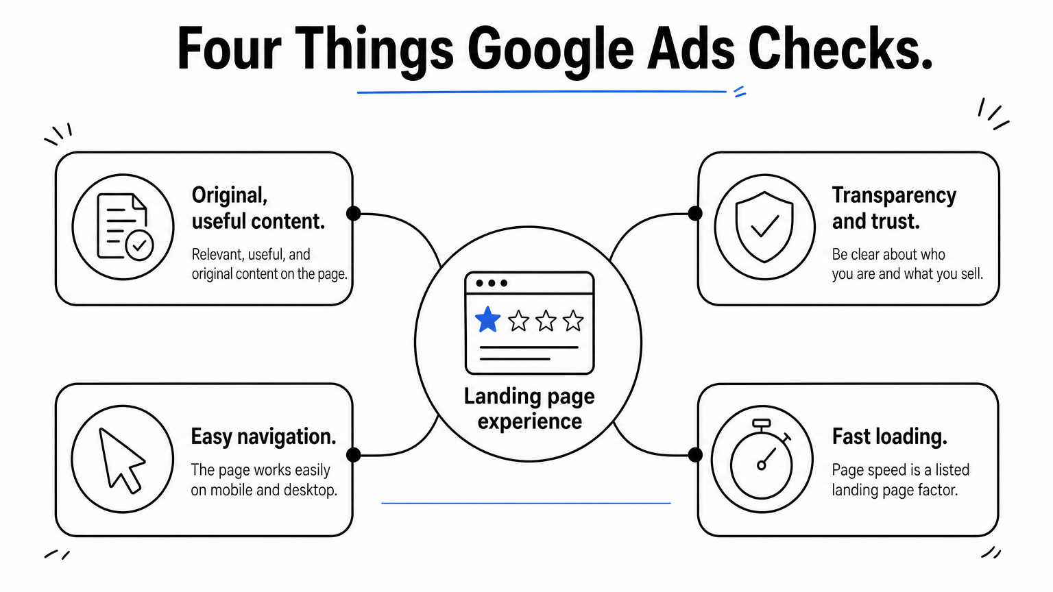
The rating is a diagnostic, not a verdict on your design taste. A Below average status means Google sees a gap in one of the four areas, and the fix is almost always on the page itself, not in the ad. Treat it as a prompt to audit, then confirm the change with your own conversion data.
Visitors and Google want the same things here. A page that is relevant, honest, easy to use, and quick tends to rate well and convert well. That overlap is why this list works for both goals.
Google rates relevance, trust, ease of use, and speed, which are the same things your visitors judge in the first few seconds.
Use the table to see which attribute answers which Google concern, and a fast way to check each one.
| # | Attribute | Google Ads factor | Quick check |
|---|---|---|---|
| 1 | Message match | Relevant content | Does the H1 repeat the ad's promise? |
| 2 | One goal | Easy navigation | One primary button, no site menu? |
| 3 | Value-first headline | Relevant, useful content | Can a stranger explain the offer in five seconds? |
| 4 | Fast loading | Page speed | Largest Contentful Paint at or under 2.5 seconds on mobile? |
| 5 | Mobile layout | Mobile navigation | Can you reach the button with a thumb, without zooming? |
| 6 | Original content | Original content | Is the text written for this page, not copied? |
| 7 | Trust | Transparency | Contact, pricing, and privacy visible? |
| 8 | Short forms | Easy navigation | Every field earns its place? |
| 9 | No bugs | Easy navigation | Full journey works on Chrome and Safari? |
| 10 | Clean traffic | Not a rating factor | Do sessions match real people? |
Message match means the page repeats the promise the ad made, in the same words and with the same offer. It is the first test a visitor runs, and it is how Google Ads reads relevance. Someone who clicked "20% off trail running shoes" and lands on a generic homepage assumes the offer is gone and leaves within seconds.
Treat the ad and the page as one message split across two screens.
If the ad and the page do not sound like the same company talking, visitors assume they clicked the wrong thing.
A page built for Campaign Monitor's email platform is a clean case. It repeated the phrase "HTML emails" throughout and used the button "Design Your First HTML Email Now," so a visitor who searched for that topic saw their own words at every step.
The common mistake is a broad ad group. One page cannot match fifty keywords. Split them into tight themes and write each page for one theme, even if the pages share a template.
A page with one goal gives every visitor the same obvious next step. Each extra link, menu item, or competing button gives visitors a reason to wander off without converting. For a good landing page experience, decide the one action you want and remove everything that does not serve it.
Start by naming the single action in one sentence, then audit the page against it.
Every element on the page either moves the visitor toward the goal or pulls them away from it.
Branch Furniture's office furniture page used several buttons with different copy, such as "Design My Office," but all of them led to the same place. The variation helped visitors picture the next step without splitting their attention.
The mistake is two buttons of equal weight, like "Buy now" and "Book a demo." Visitors who cannot choose often choose neither. There are exceptions. A high-consideration product with a long buying process sometimes does better with a fuller page, so test before you strip everything out.
A strong headline tells a stranger what you offer, who it is for, and why it matters, in plain words. Clear beats clever every time on a landing page. Most visitors read the headline and skim the rest, so the headline carries the whole pitch for many of them.
Write the headline last, after you know exactly what the page promises.
If a stranger cannot say what you sell after five seconds, the headline has failed.
Branch Furniture's "Office Furniture Made Easy" says who the page is for and what makes it different in four words. blow LTD's "Eyelash Extensions At Home" works the same way, stating the offer with no wordplay. Rover's "Get paid to play with pets" adds emotion while staying literal.
The common mistake is the abstract tagline, such as "Meet the future of commerce." It sounds polished and says nothing. Save it for brand campaigns, not for paid clicks.
A good landing page experience loads quickly enough that visitors never notice it loading. Google's Core Web Vitals give you targets: Largest Contentful Paint within 2.5 seconds, Interaction to Next Paint within 200 milliseconds, and Cumulative Layout Shift under 0.1, judged on real visits. Google Ads also lists page speed among its landing page factors. See Google's Core Web Vitals guide for the definitions.
Measure first, then fix the heaviest items.
Speed is the one attribute that every visitor feels and almost no visitor mentions.
On ecommerce storefronts, Nostra AI's Dash speed agent handles that last bullet. It monitors site speed around the clock and accelerates pages at over 300 edge locations, deployed with a DNS-level change and no code changes. Reported results include up to 47% faster load times and an expected revenue lift of about 3%, with full acceleration in about two weeks.
Here is how that lift reads on paper. A store earning $1,000,000 a month from paid landing pages would expect about $30,000 more a month at a 3% lift. That is an expectation, not a guarantee, so measure your own result.
The common mistake is stacking tags. Each marketing pixel looks small alone. Together they can delay the first useful paint by seconds.
A mobile-first layout is designed for the phone screen first and then expanded for desktop. If the page only works on a laptop, you are sending paid clicks to a broken page. Google Ads asks for easy navigation on mobile, so a page that needs pinching and zooming also risks a weak rating.
Open the page on a real phone and try to complete the goal with one thumb.
The test for mobile is simple: can you finish the action with one thumb on a train?
Netflix's sign-up page is a good model. It asks for one email field, uses fewer than 200 words of copy, and tucks pricing details into a drop-down FAQ. On a small screen, that restraint is the whole design.
The common mistake is checking mobile only in a desktop browser's device emulator. Emulators miss real keyboard behavior, slow networks, and Safari quirks. Test on actual phones, which also sets up the bug checks in attribute 9.
Original, useful content answers the questions a visitor has before acting, using details that only you can supply. It is the "relevant, useful, and original" requirement in Google's guidance, and it is also what makes a visitor feel the offer is real. Thin or copied text hurts both trust and rating.
Write for the decision, not for word count.
Length should follow the size of the decision: short for a cheap impulse buy, longer for something expensive or complex.
Western Rise's pants page had a "Tech specs" section naming exact materials and features, such as a gusseted crotch and an extendable hem. Goby's toothbrush page broke the product into labeled parts so visitors could see the bristles and brush head instead of reading about them. Both give shoppers facts they cannot get from a competitor's page.
The common mistake is pasting manufacturer copy that every other retailer also uses. Visitors recognize it, and Google can see the duplication.
Trust signals show a visitor that your business is real, your offer is honest, and their data is safe. Google Ads names transparency as a landing page factor, which means being clear about who you are, what you sell, and how you use information. Without that, even a well-matched page feels risky to act on.
Put the proof where the doubt appears, which is usually next to the button or the form.
Trust is built by specifics. "Trusted by thousands" proves nothing, and "4.8 from 2,300 reviews" proves something.
Goby paired a money-back guarantee with a carousel of Instagram photos that showed real handles. Class Creator put "10,000+ educators in 13 countries" above the fold, which gave cautious buyers an immediate reason to keep reading.
The common mistake is manufactured urgency, like a countdown timer that resets on reload. Visitors notice, and it damages every other claim on the page. Hidden fees do the same damage.
A low-friction form asks only for what you need to take the next step. Every extra field lowers completions, because each one is another small decision and another reason to doubt. If you can get the lead with one field, ask for one and collect the rest later.
List every field and ask what you would lose if it vanished.
Each field you remove is a decision you no longer ask the visitor to make.
Semrush's competitor analysis page asked for a single domain name and used the button "Get Insights." The form was one field, and the payoff was obvious. The Bariatric Eating page took a different route by asking for a mobile number so it could text the plan, which skipped the email inbox entirely.
The common mistake is a required phone number on a free ebook form. Visitors read it as the start of sales calls and leave. Bots also fill in forms, so a long form with no spam defense creates junk leads, which leads straight into attribute 10.
A page that works means the whole path from click to conversion functions for every visitor, on every common device. Pages can be fast and well designed and still fail a slice of visitors: a button that does nothing on iPhone, a promo code that errors, a form that never submits. Those failures do not show up in speed reports.
Test the journey, not just the page.
A visitor who hits a broken button does not file a bug. They leave, and you never find out.
This is the job of Nostra AI's Patch, the QA agent behind Edge Assurance. It walks the customer journey from homepage to checkout on real desktop and mobile devices, checks more than 100 bug patterns, and files bug reports with reproduction steps and video, before shoppers run into the problem.
The common mistake is testing only on the laptop of whoever built the page. Launching a campaign right after a theme update, without a fresh click-through, is the version of this that costs the most.
Clean traffic means the visitors in your reports are real people, so the numbers you use to judge the page are true. It is not something visitors see, but it decides whether you can trust every other metric. Bots inflate sessions, lower your conversion rate, and burn ad budget, so you may end up redesigning a page that was fine.
Compare what your analytics say with what your orders and leads say.
If a fifth of your traffic is not human, you are optimizing for the wrong visitors.
Here is a worked illustration. You buy 10,000 paid clicks at $2 each, which costs $20,000, and get 200 orders. That reads as a 2.00% conversion rate. If 8% of the clicks were bots, 800 clicks wasted $1,600, and the real rate among 9,200 human visitors is 200 divided by 9,200, or about 2.17%. The page was better than reported, and you paid for traffic that could never buy.
Nostra AI's Edge Protect, powered by the Knox bot agent, blocks malicious bot traffic before it distorts analytics or wastes ad spend, and the platform reports more than 10 billion bots blocked annually across its brands. The common mistake is treating a drop in conversion rate as a design problem before checking who is visiting.
A good landing page experience is the sum of ten small things done well: a page that matches the ad, aims at one goal, says what it offers, loads quickly, fits a phone, uses original content, earns trust, asks for little, works every time, and is judged on real visitors. None of them is difficult alone. Together they decide whether paid clicks become customers and whether Google rates your page well.
Work through the table near the top, fix the weakest row first, and measure after each change. If your store runs paid traffic, start with the part you cannot see in a design review. Edge Protect filters bad bots in real time, so the sessions and conversion rates you use to judge every other change come from real shoppers.


